I just wrote a piece on gendered branding, and when I first heard about the cereal called Man Cereal, I rolled my eyes.
But now that the packaging has finally been revealed, I find myself pleasantly surprised. Sure, it’s gendered branding, but I don’t hate it. In fact, I kind of like it. It’s a classic Day Job special, a design so unexpectedly offbeat that it instantly wins you over.
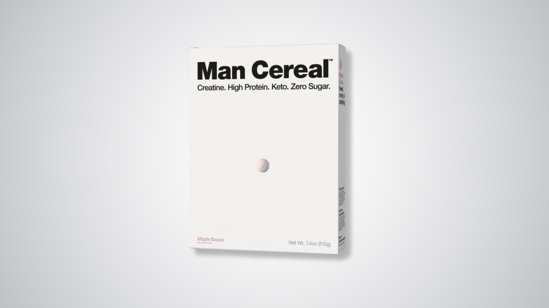
If you closed your eyes and imagined what Man Cereal might look like, you’d never picture a crisp white box with a lone cereal piece dead-center. But that’s exactly what Day Job dreamt up. The design takes a very blunt approach to packaging that’s almost aggressively minimal. The box is all white, with the name in heavy black sans-serif type dominating the top. Below, a single cereal piece sits dead center. That’s it. No overflowing bowls, no fake milk splashes, no action photography. It’s so pared back that it almost dares you to question whether this is even real.

But it is.
The supporting copy is equally stripped down: Creatine. High Protein. Keto. Zero Sugar. That’s intentional—it’s cereal stripped down to the essentials, everything you need reflected in one tiny ball of cereal with straightforward copy to boot. The clean, consistent type hierarchy keeps your eyes moving in one straight line; the flavor, maple bacon, is printed small in the corner, interestingly subtle.
The minimalism is strategic. Even just imagining this box in the cereal aisle feels like you’re in on some kind of branding inside joke. It communicates confidence and holds on to the idea that the product doesn’t need to convince you by being overly designed. Imagine this between a box of Lucky Charms or Fruit Loops, or even the other “adult” cereals making the rounds loaded with protein.. When everyone else’s design swerves one way, Day Job reliably floors it in the opposite direction. But it also invites interpretations it may not have planned for. I heard someone compare that lone cereal piece to a nipple, and now I can’t unsee it.
And yes, this brand is called Man Cereal. And yes, it fits within the world of gendered branding, but the packaging almost clears it of the negative elements of what gendered branding promotes. The design is neutral and understated without leaning into the overused tropes that you’d anticipate from a brand with the same name. You wouldn’t assume that men would need a cereal specific to them, but peruse the aisle and the demographic certainly isn’t being spoken to. So shockingly, I get it. I don’t even mind it because it feels like we’re all in on the joke.
I will say, however, that I was smitten with the teaser packaging the brand put out early on, with “Man Cereal” scribbled in Sharpie across a plain white box. That unpolished version felt effortlessly raw and offhand. It had a chaotic energy that matched the name and product concept almost better than the highly considered minimalism here.

The final design is undeniably tight, but the teaser had something that design polish can’t replicate: the charm of not trying so hard. Who knew the power of a Sharpie design?
Markers aside, Man Cereal will launch this fall.







1 response to “At Last, a Cereal for Men: Day Job Ushers In Man Cereal”
The gendered commentary provided by this package suggests that men are inherently without emotion. Although it may differ from the armor-clad warrior action-hero aesthetic, I am unsure if it is better, as the qualities of the product itself can be just as interesting to any gender; the act of gendering the product, however, reflects the core issue.