A Canadian Icon Gets a Makeover in BrandOpus’ Redesign for Molson Beer
By
Published
Filed under

By
Published
Filed under
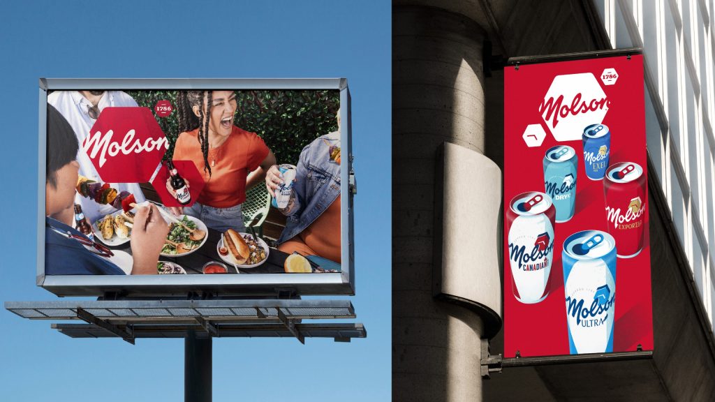
Canada’s favorite draft just got a shiny, clean-cut new look from BrandOpus. While the redesign keeps a lot of the brand’s most recognizable elements, it significantly tones down the classic maple leaf, which still makes a cute appearance as the dot on the “i” in the Canadian draft.
Overall, the refresh centers the brand’s curly, swirly script wordmark, which the hexagon logo cuts a bit at the edges. The overall feel is a bit more global, polished, and current while still retaining a timeless Canadian feel.
Get unlimited access to latest industry news, 27,000+ articles and case studies.
Have an account? Sign in


