
As a lover of minimalism, Facile Skincare’s packaging, designed by Another, feels utterly soothing. The creamy primary packaging hue paired with a poppy hue creates a welcoming yet refreshing statement, ideal for a company that prides itself on making skincare easier and more accessible. The packaging is refined, but there’s clearly a whimsical side.
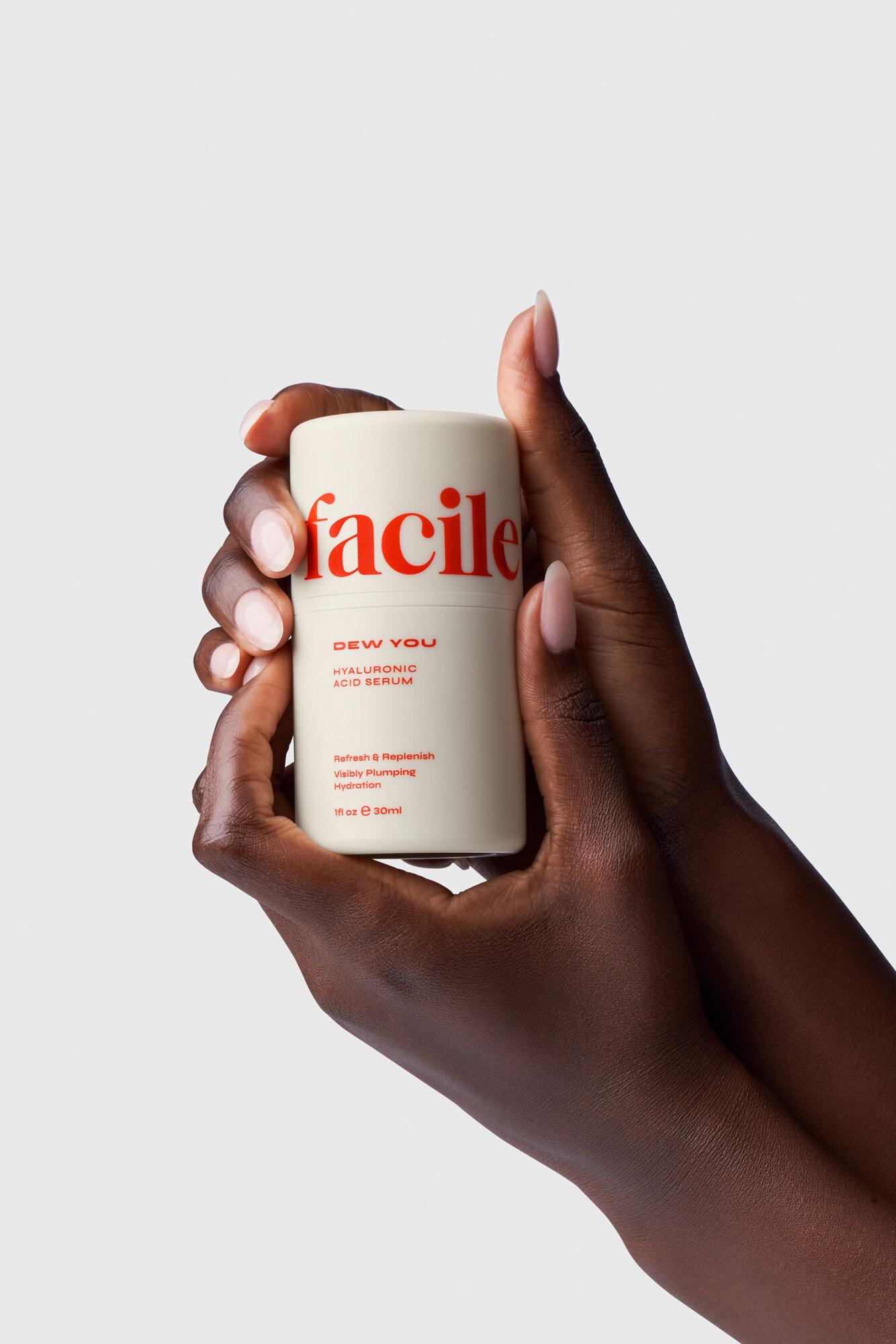
Facile is a medispa in Los Angeles that was expanding into the development of their own skincare range, in addition to moving their flagship location into a new home. With this, they wanted to both refresh their brand to suit their new physical space, while developing a new skincare brand system. Our goal was to develop a visual system that felt feminine and timeless, while still making space for playful use of color – something less traditional in category. With a core tagline of “good skin should be easy”, we wanted to ensure that our product & packaging design felt clear and sophisticated, but with a playful twist.


