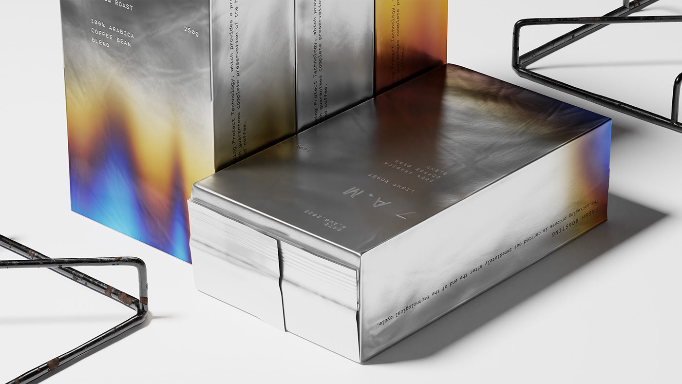
The stronger the roast, the darker the packaging color. Designed by omsky studio, 7 A.M Coffee’s packaging takes a highly visual approach, clearly inspired by the process of roasting. The foil packaging, paired with the fire-inspired design element, creates a highly exceptional design proving the power of taking inspiration from everyday visuals that are often taken for granted.
Morning. The sun begins to peek. The familiar smell of freshly brewed coffee slowly fills out the space of the room — the elusive beauty of everyday life. There is no doubt that, we all have things and habits that we don’t want to change. Over time, they become even more valuable…