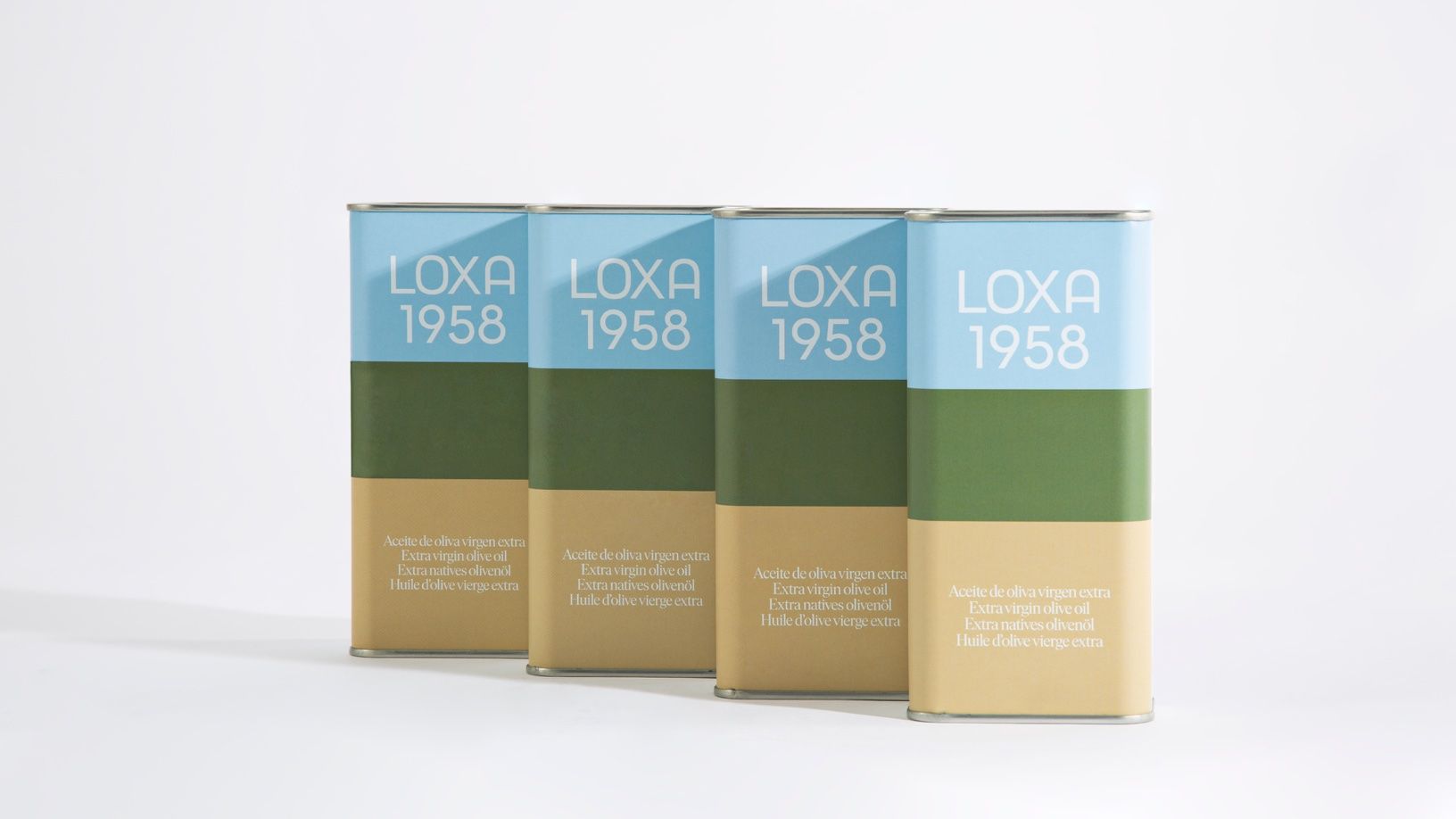
Behind mixers and salt and pepper shakes, it seems that olive oil is becoming the next hottest kitchen accessory. And as long as there are beautiful options to choose from, it only makes sense that you’d match the packaging to your decor. Loxa 1958 is an olive oil brand that’s delivering the chicest packaging, inspired by the landscape of Poniente Granada. The rich shades found on the packaging paired with a thin yet retro-inspired font create a packaging system that’s not only unique but also perfect for keeping on your kitchen countertops to add a hint of je ne sais quoi.
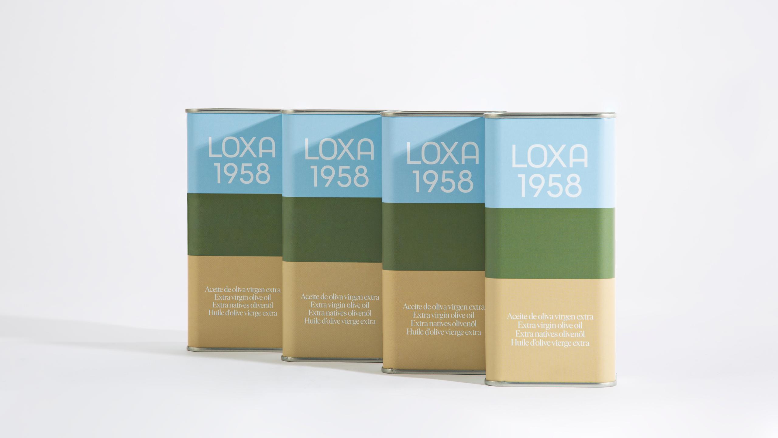
If you have ever had the opportunity to travel through the landscapes of the Poniente Granada, between its olive groves, farmland and holm oaks, surely, its colors will never escape your memories. Greens, browns, blues. That connection with nature and with a past that was always in color, undoubtedly, was presented to us as the perfect base on which to anchor Loxa’s history on a graphic level, along with its own typography.
















