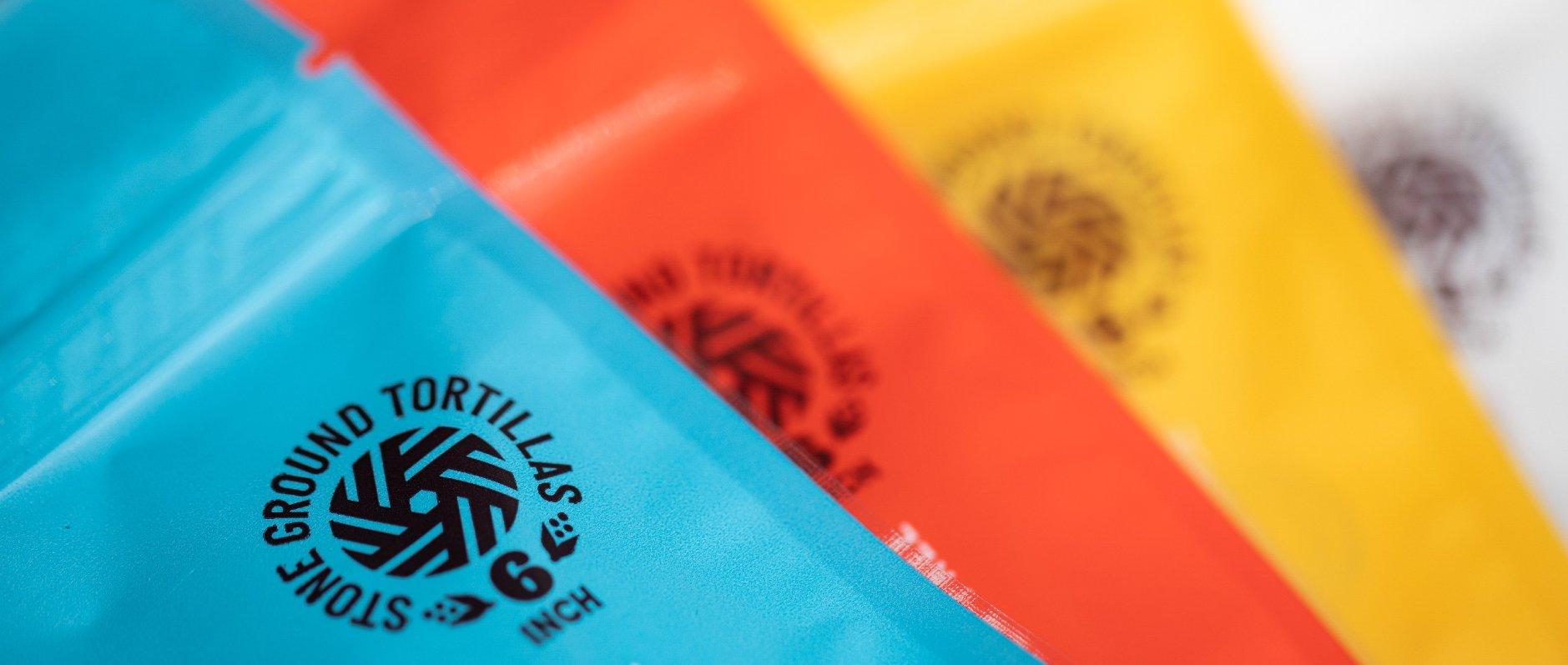
The funky, grass-roots packaging for Yoli Tortilleria is sure to instantly grab consumers attention. With it’s vibrant color-scheme, and instantly recognizable hero illustration of a young woman with a bandana on her head and sunglasses, Yoli establishes itself with a strong brand identity. The personality of the packaging is furthered by the font chosen that makes the Y in Yoli look like a corn stalk.
Yoli Tortilleria was created to fill the authentic tortilla void that founders, Marissa and Mark noticed in Kansas City. With great passion and pride, Yoli produces the best quality, stone ground tortillas while ensuring they are mindful of the land and those who are involved in every step of the process. Previously known as KCMEX, Yoli Tortilleria came to us in need of a brand identity re-design as the demand for their artisan corn tortillas spread beyond the initial B2B needs and they looked to sell their product direct to consumers.