TRUFFL-Designed CPG Brand Korean Bros Has Some Not-So-Serious ‘Seoul’
By
Published
Filed under
By
Published
Filed under
Korean culture has engrossed Americans in a big way, with beauty products and pop music becoming a big part of the American zeitgeist. It’s unsurprising that Korean food has also taken a toehold on US shores, but has yet to realize its full potential as a cross-cultural force.
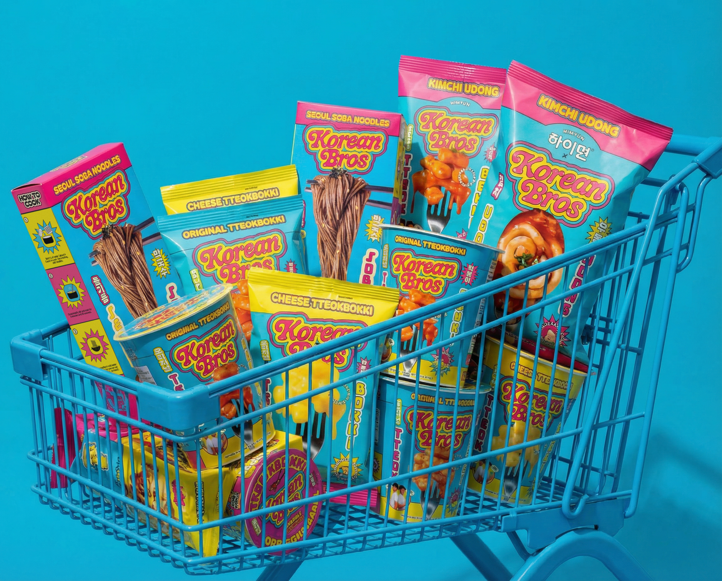
A new brand of packaged Korean staples, called Korean Bros, is setting out to strike while the K-Culture iron is hot. Korean Bros’ range of products includes tteokbokki (a traditional street food made from rice cakes in original or cheese sauce), kimchi udong noodles, and Seoul soba noodles.

Working with agency TRUFFL, the brand identity is unapologetically rooted in internet culture and memes, is bold and bombastic, with plenty of humor to boot. The internet has played an immense role in cultural cross-pollination, including bringing Korean culture to the rest of the world, so it makes sense that a brand like Korean Bros would tap into the internet’s sensibility as a large part of its identity.


“The brief was deceptively simple: create the de facto Korean food brand in America that can appeal to mainstream audiences who may be unfamiliar with dishes like tteokbokki, while also genuinely resonating with Korean Americans who would see through anything inauthentic. The brief was essentially to make the brand catch up to the culture,” says Raphael Farasat, founder and creative director at TRUFFL.
Raphael goes on to explain that the K-food CPG category has lagged behind other K-categories, such as K-pop, K-beauty, and film.

“Everything in the Korean food category defaults to heritage tropes like brush stroke calligraphy, earth tones, and traditional photography that codes the food as foreign and ceremonial, when the culture itself is one of the loudest and most irreverent forces on the planet,” Farasat says.

A vivid and saturated yellow is Korean Bros’ primary color, bolstered by equally dynamic hot pink and electric cyan. Graphics are just as bombastic as the rounded, exaggerated letterforms of the wordmark. Visually, there’s an irrelevance that feels almost like a frenetic cartoon.
“Hangul lettering appears on every package as a bilingual communication layer, not ornamental exoticism. That was a deliberate strategic decision; the founders are Korean American, the brand is Korean-owned, and the Korean language isn’t decoration; it’s identity,” Farasat says.


Another major part of the branding is the Korean bros themselves. Instead of being illustrated mascots, the brothers, Dok and James, are portrayed by real actors in wild and humorous ways, like photographs parodying films like Men in Black, Stepbrothers, The Other Guys, and Nacho Libre, movies often quoted and memed in internet culture. “We developed a comic book–style sticker and element system, such as badges, starbursts, and callout shapes, that gives the packaging this layered, almost collage-like energy. It makes every surface of the package feel alive and densely packed with personality,” says Farasat.


The brand is introducing Korean street food like tteokbokki to American consumers who are already infatuated with some aspects of K-culture, but have yet to dive into the deep end of K-food. But it also has to remain true to Korean culture, lest Korean-Americans call it out. “The biggest challenge was maintaining a maximalist system without it collapsing into chaos. When your brand language is loud, saturated, and illustration-heavy, the discipline required to keep it cohesive across formats is enormous,” Raphael says. “A pouch, a rigid box, and a sauce packet all have completely different structural constraints, and the system needed to feel unmistakably Korean Bros on every one of them while still adapting to the physical realities of each format.”

CPG brands live in the real world, but that doesn’t mean they can’t embrace the irreverent, sometimes chaotic nature of internet culture. Mixing Korean authenticity with internet culture is refreshing and new, making the Korean Bros’ brand identity captivating, but most of all, fun.


