Supra Turns Ancient Architecture Into a Minimalist Mezcal Bottle
By
Published
Filed under
By
Published
Filed under
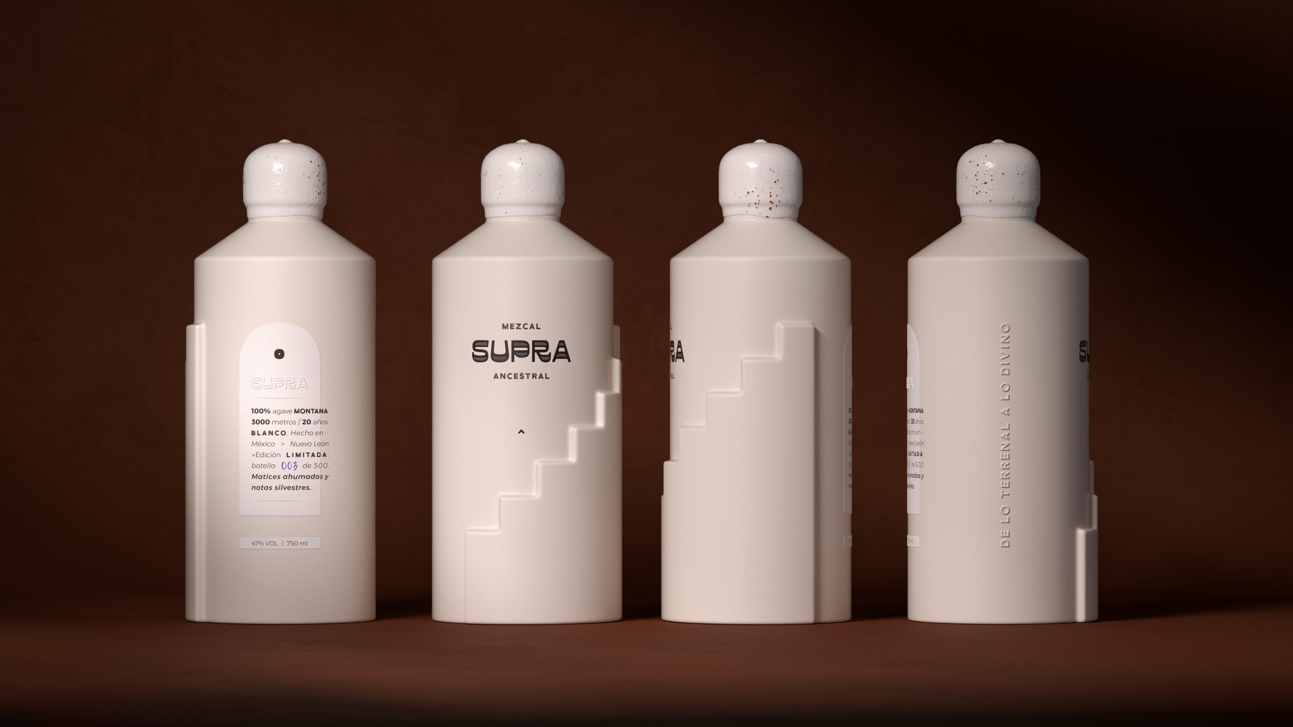
The bottle design for Supra by VANESA GARCÍA ESTUDIO takes inspiration from Mexican pyramids, with an embossed staircase molded directly into the ceramic form. The shape is sculptural, while the color palette sticks to a minimalist matte off-white that lets shadows and light do the talking.
The typography on the packaging is sparse and technical, paired with blind embossing that adds texture without noise. The label and subtle cork top nod to craftsmanship, grounding the futuristic form in something tactile, and the typography on the label bleeding off the edge adds just another little pop of subtle intrigue.
Get unlimited access to latest industry news, 27,000+ articles and case studies.
Have an account? Sign in