Moctezuma Treats Cement Not As A Commodity, But As A Cultural Symbol
By
Published
Filed under
By
Published
Filed under

80 Years Of Legacy, No Visibility
Moctezuma Cement is a brand that’s been building on Mexico’s foundation for over 80 years. Named after the famous Aztec emperor, it’s deeply rooted in national history. With distribution in 700+ locations, it’s widely recognized and trusted among builders, workers, and vendors.
Category Of Sameness
The cement category is stuck in visual sameness. Most cement brands rely on the same color palette of blue and red, and purely functional packaging. Branding is minimal. Bags are viewed as disposable. In a low-interest category, Moctezuma saw an opportunity to lead through meaning.
Mexico Was Changing, Cement Wasn’t.
At the same time, Mexico was shifting. Cultural pride, identity, and sustainability were becoming stronger social drivers. People expected more from brands—especially those rooted in heritage. Moctezuma needed to evolve, without erasing the story it had built so far.

A Rebranding Aligned With Culture – And Business
The rebrand was timed with a broader business evolution. It aligned internal clarity with external meaning. Most importantly, it acknowledged those who interact with cement every day, but rarely see themselves reflected in it.
The idea was simple: treat cement not as a commodity, but as a cultural symbol. Named after Moctezuma—the Aztec emperor synonymous with legacy and permanence—the brand had history in its DNA, but lacked a modern visual identity to match.
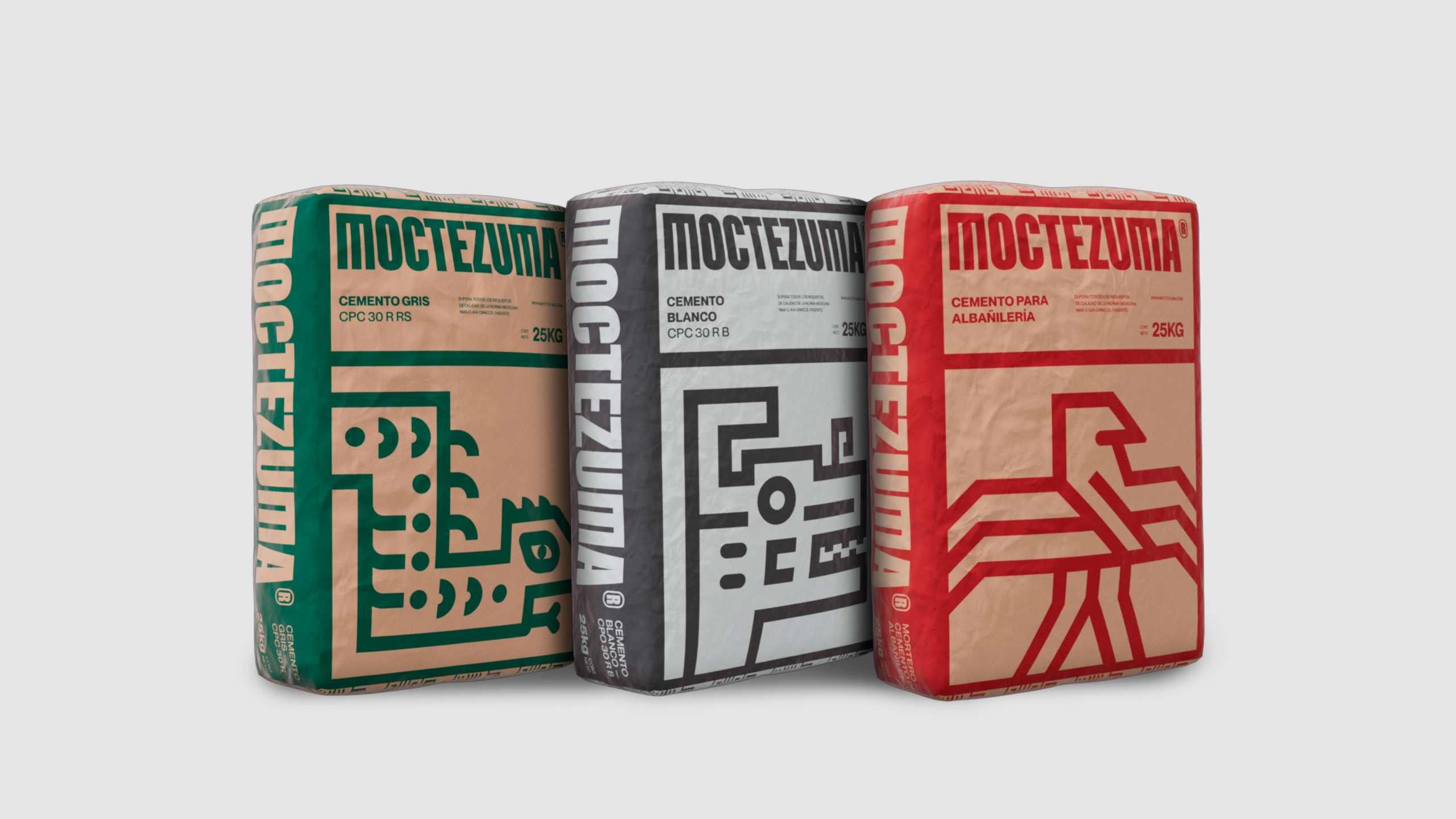
We built a modular design system rooted in Mexican heritage. Inspired by pre-Hispanic geometry and stone mosaics, and reimagined symbols. Each one represented a value—strength, transformation, or progress—anchoring the brand in cultural symbolism.

Stacked cement bags became storytelling tools. Side panels—often the most visible surface of cement packaging—were turned into modular murals, and what was once overlooked became iconic.
Cement doesn’t have to be invisible. Not when it carries culture.
Cement is everywhere—yet invisible.
It builds our world, but its branding is purely gray, functional, and forgotten. In a category where design is treated as disposable and purely utilitarian, Moctezuma Cement saw an opportunity to lead with meaning. That’s how we introduced a modular design system, re-envisioned stacked sides of cement bags into murals, turned branded trucks into moving OOH media, and symbols into a modular, living design system.
This reedesign was used to inject pride, relevance, and cultural identity into one of Mexico’s most silent categories.
We created a brutalist bespoke typeface—bold, grounded, and geometric—to reflect the physical presence of cement and the legacy of Moctezuma. Built to anchor the brand, it delivered clarity across all applications.
Cement bags live stacked. Not front-facing. We turned their side panels—the real-world point of view—into modular murals. Packaging became a powerful storytelling surface, and not just a container.

A Color Shift That Reclaimed National Pride
We moved beyond the category’s typical blue, white, and red. Instead, we adopted Mexico’s flag: green, white, and red—signaling sustainability, cultural pride, and national relevance.
Turning Cement Trucks Into Culture in Motion
We transformed Moctezuma’s trucks into moving out-of-home media—wrapping them entirely in brand elements. Each one became a mobile statement of identity, pride, and disruption.

This work could only have come from Mexico, for this brand, at this moment. A category built on silence was given a voice. The new identity didn’t just modernize—it found its voice. Moctezuma became more than a material. It became a mirror of the culture that builds with it.
42% More Logo Visibility
The new identity increased logo visibility by 42%—especially across stacked packaging and in-store displays, where the brand had previously gone unnoticed.
85% More Visibility on Cement Trucks
While competitors brand only a small section of the drum, Moctezuma wrapped the entire area—transforming logistics into moving media with 85% more visual presence.

Successful Adoption and Strategic Alignment
The system was embraced by the C-suite, investors, and all departments—aligning teams under one unified visual language after years of fragmentation.
Earned National Media Coverage
Before any major paid campaign launched, the rebrand generated unpaid editorial coverage in over 20 national outlets. The design itself became the story—proving its cultural relevance from day one.


