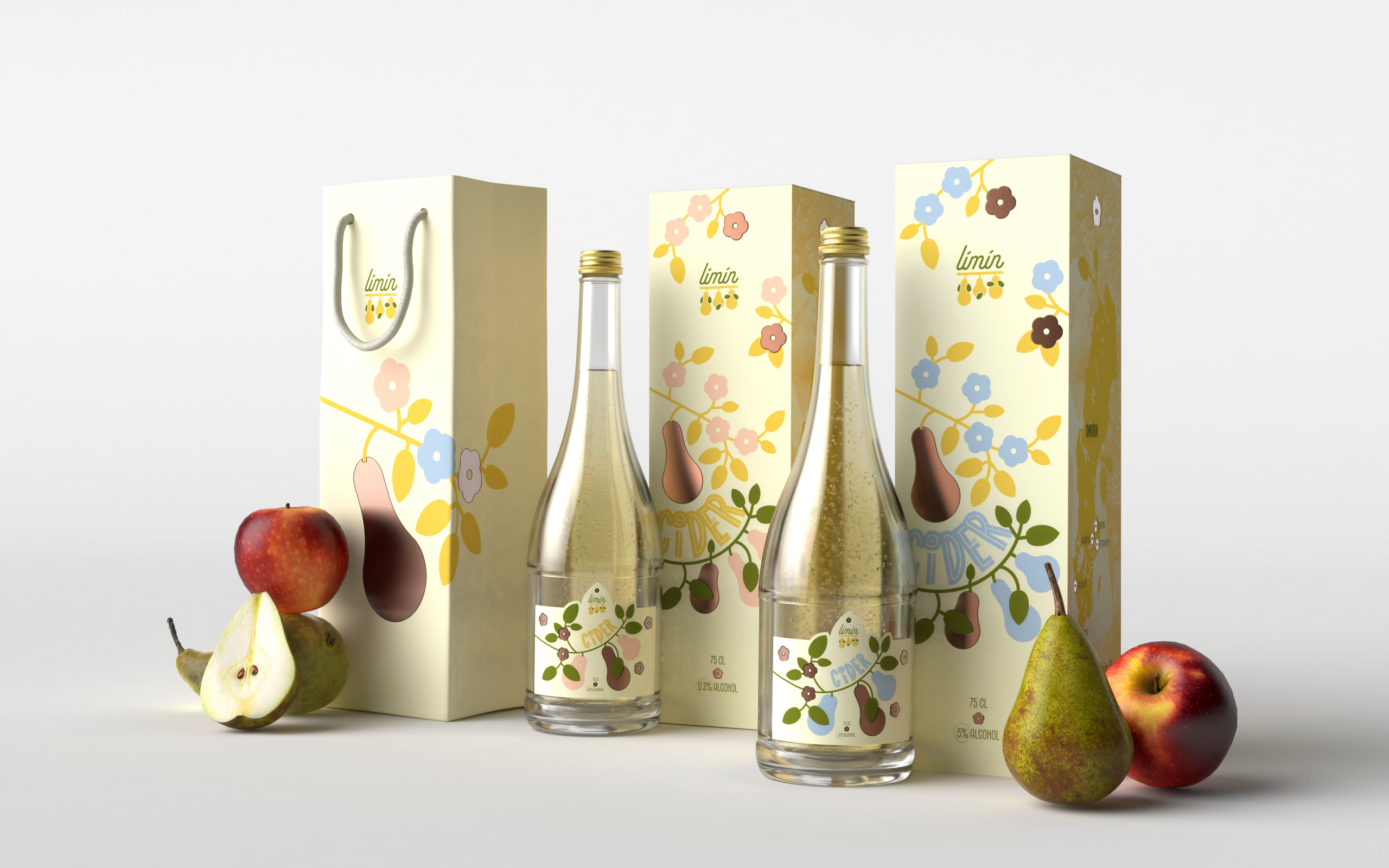
Limin’s cider packaging adopts a folk art style that echoes traditional Chinese floral textile prints. VRLN Studio built the system around a pear branch pattern, with delicate line-drawn flowers and hanging pear fruit
The color palette does plenty of storytelling on its own, bringing in warm, earthy tones for soil, soft pink and yellow pulled from blossoms and ripe fruit, green for new growth, and pale blue for open sky, walking you through an entire seasonal cycle. The logo stays small and lowercase, with an almost handwritten feel, sitting quietly above the illustration, which gives the packaging an air of serenity that matches the brand’s idea of patience.