Haven Positions Toilet Paper as a Wellness Product
By
Published
Filed under
By
Published
Filed under
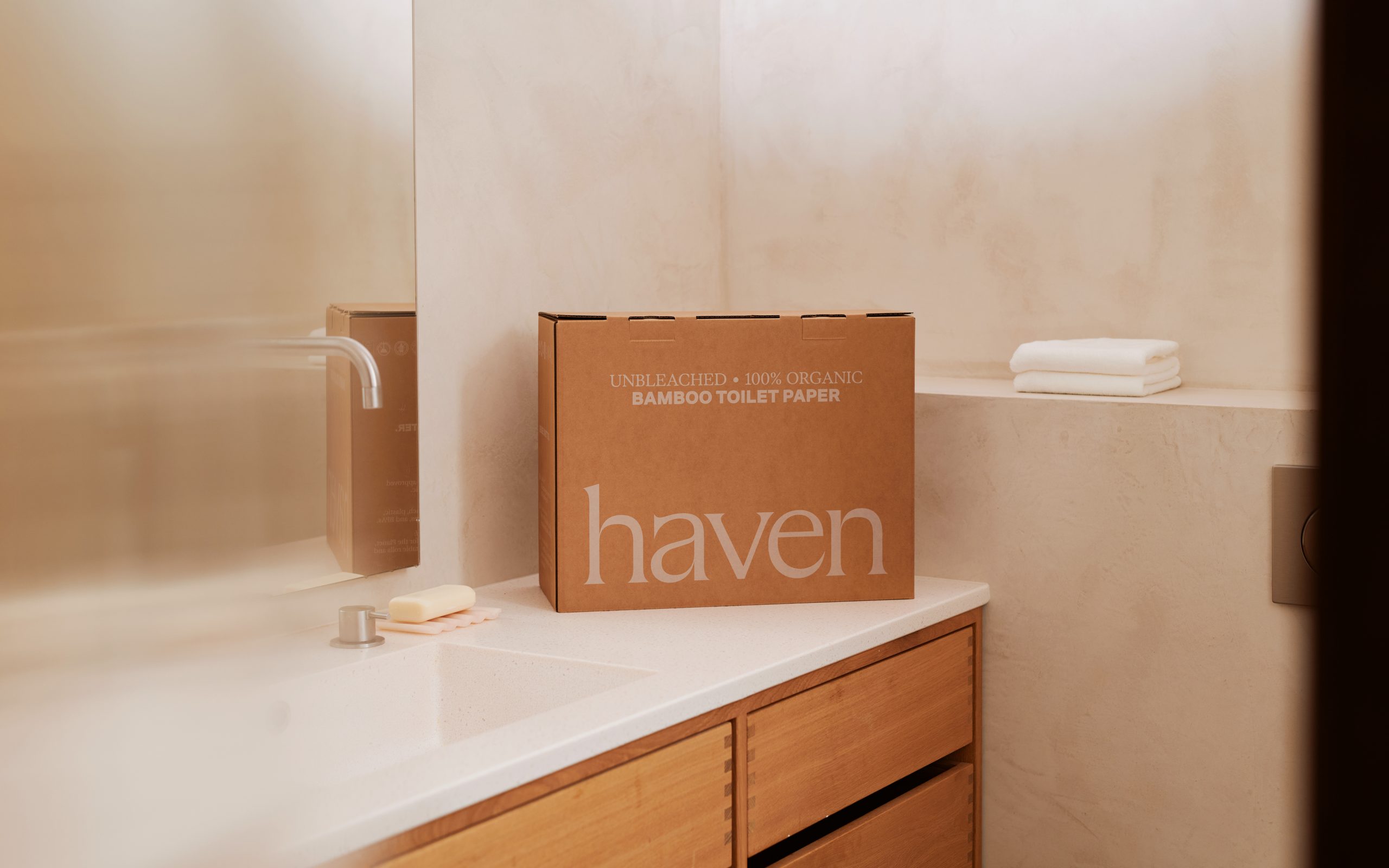
Toilet paper is likely the last category anyone expected to get a wellness branding moment, and yet here we are in an era where the bathroom shelf is being curated with the same intention as a skincare routine.
Studio Marina Veziko designed the full identity and packaging system for this US-based bamboo brand, and the central decision to lean into the natural beige of unbleached kraft rather than performing the artificial white. The wordmark is a lowercase serif printed directly on the kraft surface in tonal beige, sitting alongside duotone nature photography and a periwinkle blue type accent on the individual rolls that introduces just enough calm contrast to push the design firmly into wellness territory. It’s simple, but effective, which is exactly all you need from your toilet paper.

At the heart of Haven’s packaging is a simple shift in perspective: toilet paper treated as body care.
Haven is a US-based brand built on the belief that what touches your skin matters. In a category dominated by bleached, utility-driven products, the packaging needed to communicate a gentler, health-first alternative. Studio Marina Veziko created the brand identity and packaging system, and led the art direction, to position Haven closer to skincare than household paper goods.

The solution uses a restrained palette of beige and muted natural tones drawn from Haven’s unbleached bamboo paper, challenging the category convention that artificial white signals cleanliness. Natural, eco-conscious materials reinforce the product’s chemical-free, skin-conscious positioning while maintaining a premium, high-end feel.

For an e-commerce brand, the shipping box also functions as the first physical brand touchpoint. The unboxing sequence was designed as an extension of care, with a printed forest image on the inner layer of the box and silk-paper-like wrappers featuring eight nature photographs by a local LA-based artist. These details create a calm, considered reveal that gives the product a stronger emotional presence from the moment it arrives.
The result is an e-commerce packaging system that protects the product in transit while introducing Haven as a design-led, wellness-focused brand for a health-conscious, visually literate consumer.


1 response to “Haven Positions Toilet Paper as a Wellness Product ”
That’s my company! We’re stoked to be featured in the Dieline!
We challenge you to put some thought into your most used daily essential: toilet paper. We’re craft with 100% unbleached, PFAS-free bamboo.
Check us out at: http://www.havenpaper.com