HanLu’s Visual Identity for Nurans Pet Nutrition Simplifies All That Sciencey Stuff
By
Published
Filed under

By
Published
Filed under
Nurans dedicates itself to enhancing pet immunity through scientific research and high-quality product development. It sought a visual identity that conveyed simplicity and scientific integrity and enlisted designer HanLu to craft a logo and packaging that encapsulates that ethos with a minimalist yet informative approach.
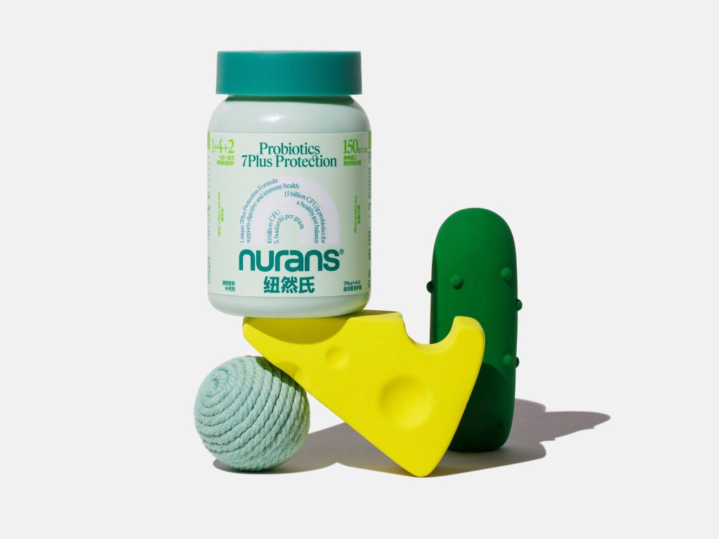
The secondary graphic with the “n” shape comes filled with product details and adds a layer of clarity and professionalism. Playful illustrations of cats and dogs bring a touch of fun, making the packaging not only educational but engaging for pet owners.
Get unlimited access to latest industry news, 27,000+ articles and case studies.
Have an account? Sign in