CF Napa Brand Design’s packaging for Furnace Street Distillery reflects a deep connection to the distillery’s hometown and history. Inspired by the nearby Frankfort Iron Works, the brand strategy, logo, and packaging exemplify a sense of artistry and community morale. CF Napa crafted a compelling brand story and ethos through the DNA process, highlighting Furnace’s welcoming character. The eye-catching labels, featuring pastel hues, nostalgic typography, and a furnace illustration, pay homage to the region’s iron production heritage with a weathered texture and a touch of gold foil, blending history and modern allure seamlessly.
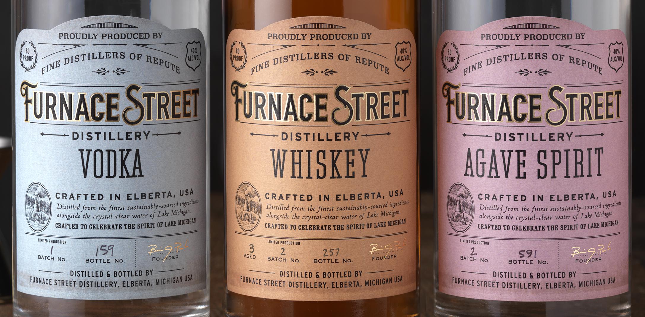
Elberta, Michigan-based Furnace Street Distillery came to CF Napa to develop the brand strategy, story, logo, and packaging for their startup distillery. Their name was inspired by the historic Frankfort Iron Works located across the street from their distillery. The founders wanted to honor their hometown with an artisanal brand that captured the history and beauty of their close-knit community. CF Napa took Furnace Street Distillery through the DNA process to develop the brand story, brand ethos, and consumer reasons to believe.