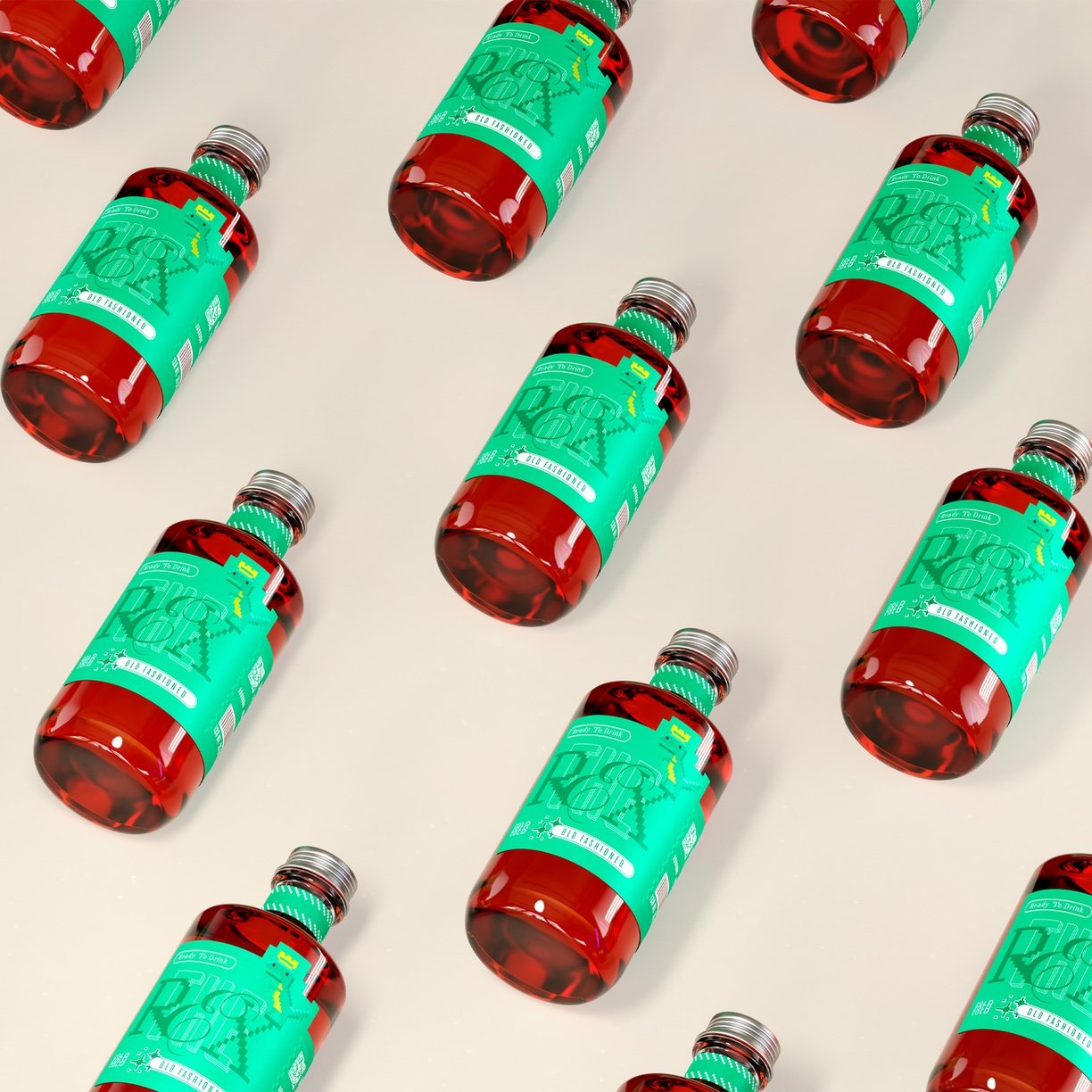
Juan Salvador Aravena’s packaging design for “The Rex” captures the essence of the RTD brand, catering to young adults born in the ’90s and representing a subculture of gamers. The design communicates the brand’s video game aesthetic through the logo, a bitmap inspired by Grotesk and Serif typefaces, and the manuscript “E,” adding a touch of artisanal charm. At the same time, the image of the T-Rex as the king evokes a heroic archetype. The use of jade, darker green, and white accents in the color development further distinguishes the brand, and the cylindrical bottle with a long neck and thick glass base exudes a sense of elegance and substance, enhancing the overall drinking experience.

In response to the growing popularity of bespoke mixology, we have created “The Rex”, an RTD brand that aims to elevate the drinking experience for young adults born in the ‘90s. Hedonistic and nostalgic, this generation is now fully grown, and the brand aims to represent one of its most prominent subcultures: gamers. With an exciting and contemporary personality, the brand’s attributes and characteristics help to cement its style, generating the coherence necessary to shape all the tools of its visual system. The design is created through a language that aims to communicate the defined concept, where video game aesthetics acquire differentiation and consistency. With an associative name, conveying uniqueness and distinction, digitalization is incorporated throughout the entire proposal.