Roman Klis' Pacific Foods Refresh Reminds Us That Soup Season's Back, Baby
by Rudy Sanchez on 09/27/2023 | 2 Minute Read
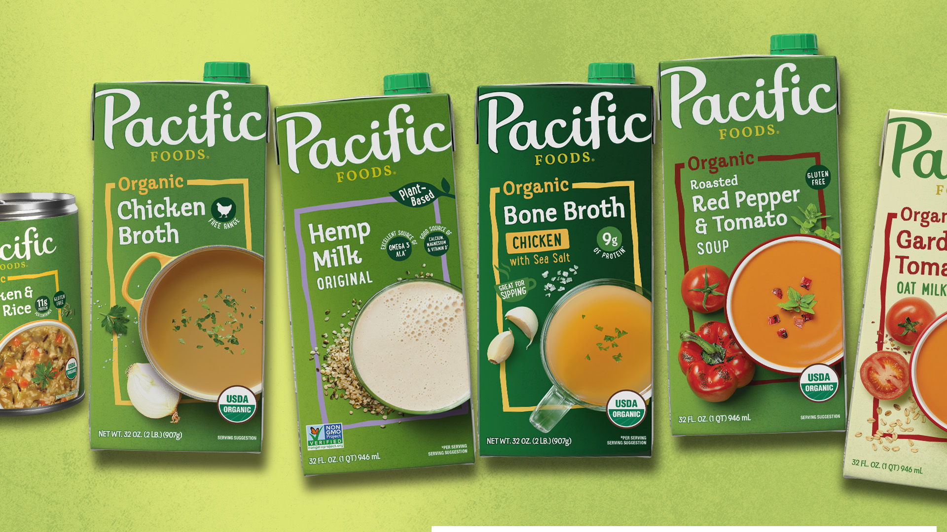
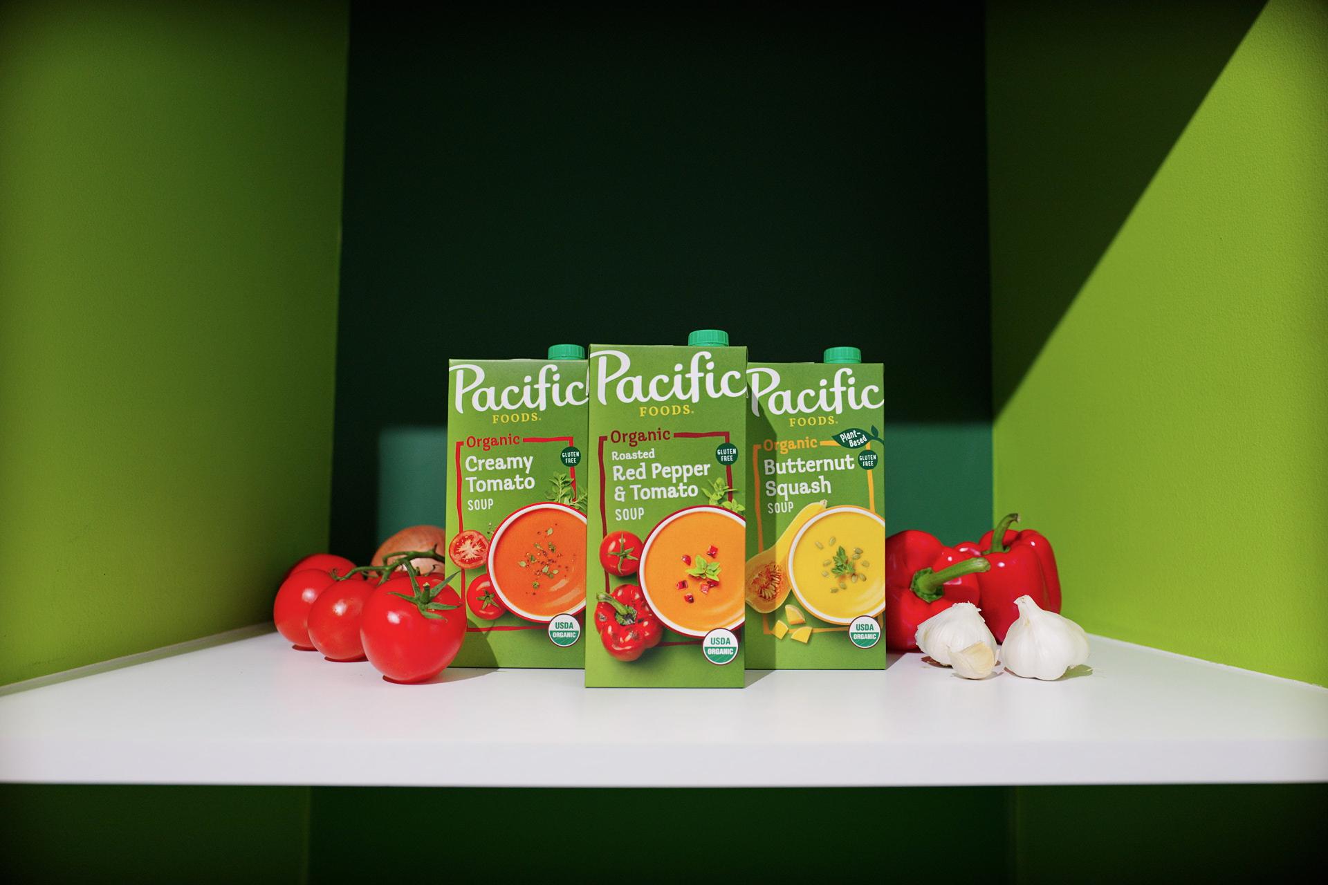
The Beckys of the world might go ga ga over some basic pumpkin spice every fall, but the real OGs know that autumn is actually soup season. Whatever your druthers—stews, broths, and chowders—a hearty bowl of piping-hot nourishment is good for what ails you when the air is crisp and nippy.
It’s little surprise then that Campbell’s Pacific Foods has unveiled a brand refresh at the start of SOUP SZN. Enlisting the talented folks at Roman Klis Design, Pacific Food’s new visual identity refocuses on the brand’s primary emphasis on organic, sustainable, and accessible offerings.
Pacific Food’s comfy wordmark is refined and unbound in this refresh, standing alone with “Pacific” in a homey script font. At the same time, a more serious serif gets deployed for “Foods” underneath, lending authority and balance to the approachability of “Pacific.” A sense of warmth, comfort, and hominess continues throughout the refresh, including the updated food photography, which is now more prominently featured on the updated packaging. Additionally, the color palette is revisited, with a darker green used on the packaging to contemporize and highlight the rest of the refreshed components.
Beyond the front panel, the new packaging effectively communicates Pacific Foods’ commitment to sourcing organic ingredients and donating a million meals annually through additional graphics on the carton and labels. New callouts like “plant-based” also speak to consumers who are flexitarian, vegan, or otherwise eschewing animal products.
Roman Klis’ refresh highlights the primary qualities of the Pacific Foods brand, but it also successfully taps into the universal comfort and sense of nourishment inherent to a hearty bowl of soup on a chilly day to great effect.