Tinterra’s Gold Flecked Wine Labels Are Highly Sophisticated
By
Published
Filed under

Published
Filed under

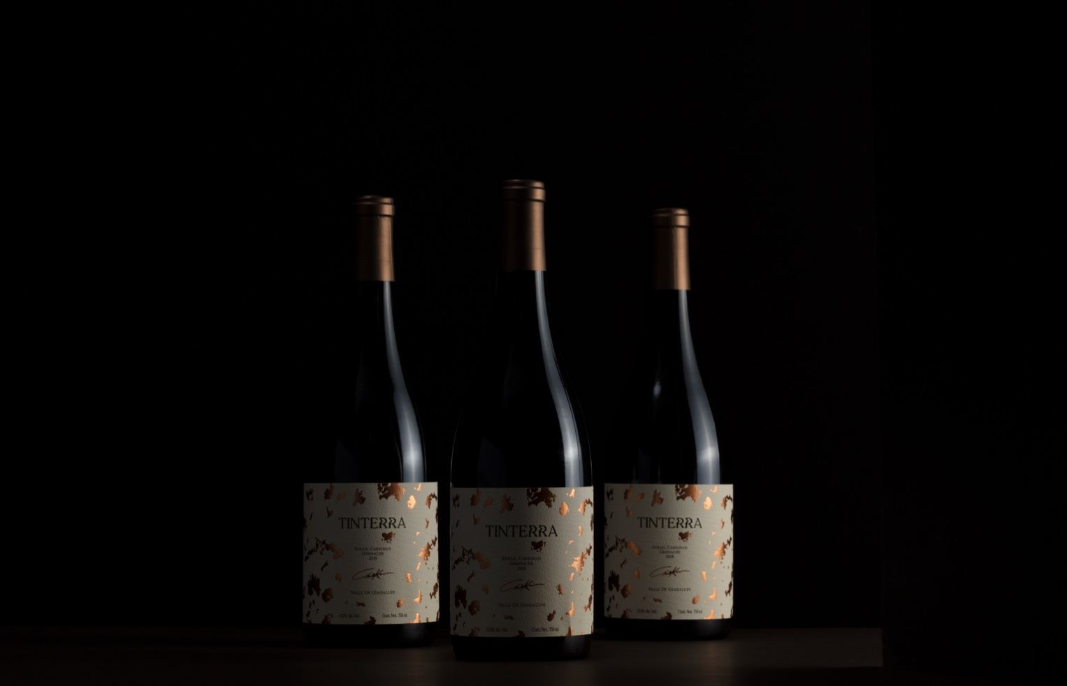
Human designed the highly mysterious yet refined packaging for wine brand Tinterra. The gold flecks paired with the natural label are elegant yet add a tasteful splash of personality. This packaging system is as sophisticated as it gets.
Valle de Guadalupe’s best kept secret is ready to be told. Introducing Tinterra. The label, represented as a map, symbolizes the arduous task of finding the best place to harvest in the region and the Xolo, the guardian of secrets since ancient times. The distorsion on the logo represents a whisper, enhancing the “secret” concept into the type. Printed in cotton paper that highlights a luxurious and premium feel that will sure stand out on the shelf.
Add project credits with Dieline PRO | Log in
Get unlimited access to latest industry news, 27,000+ articles and case studies.
Have an account? Sign in
To provide the best experiences, we and our partners use technologies like cookies to store and/or access device information. Consenting to these technologies will allow us and our partners to process personal data such as browsing behavior or unique IDs on this site and show (non-) personalized ads. Not consenting or withdrawing consent, may adversely affect certain features and functions.
Click below to consent to the above or make granular choices. Your choices will be applied to this site only. You can change your settings at any time, including withdrawing your consent, by using the toggles on the Cookie Policy, or by clicking on the manage consent button at the bottom of the screen.