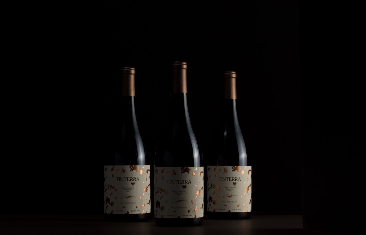
Human designed the highly mysterious yet refined packaging for wine brand Tinterra. The gold flecks paired with the natural label are elegant yet add a tasteful splash of personality. This packaging system is as sophisticated as it gets.

Valle de Guadalupe’s best kept secret is ready to be told. Introducing Tinterra. The label, represented as a map, symbolizes the arduous task of finding the best place to harvest in the region and the Xolo, the guardian of secrets since ancient times. The distorsion on the logo represents a whisper, enhancing the “secret” concept into the type. Printed in cotton paper that highlights a luxurious and premium feel that will sure stand out on the shelf.


