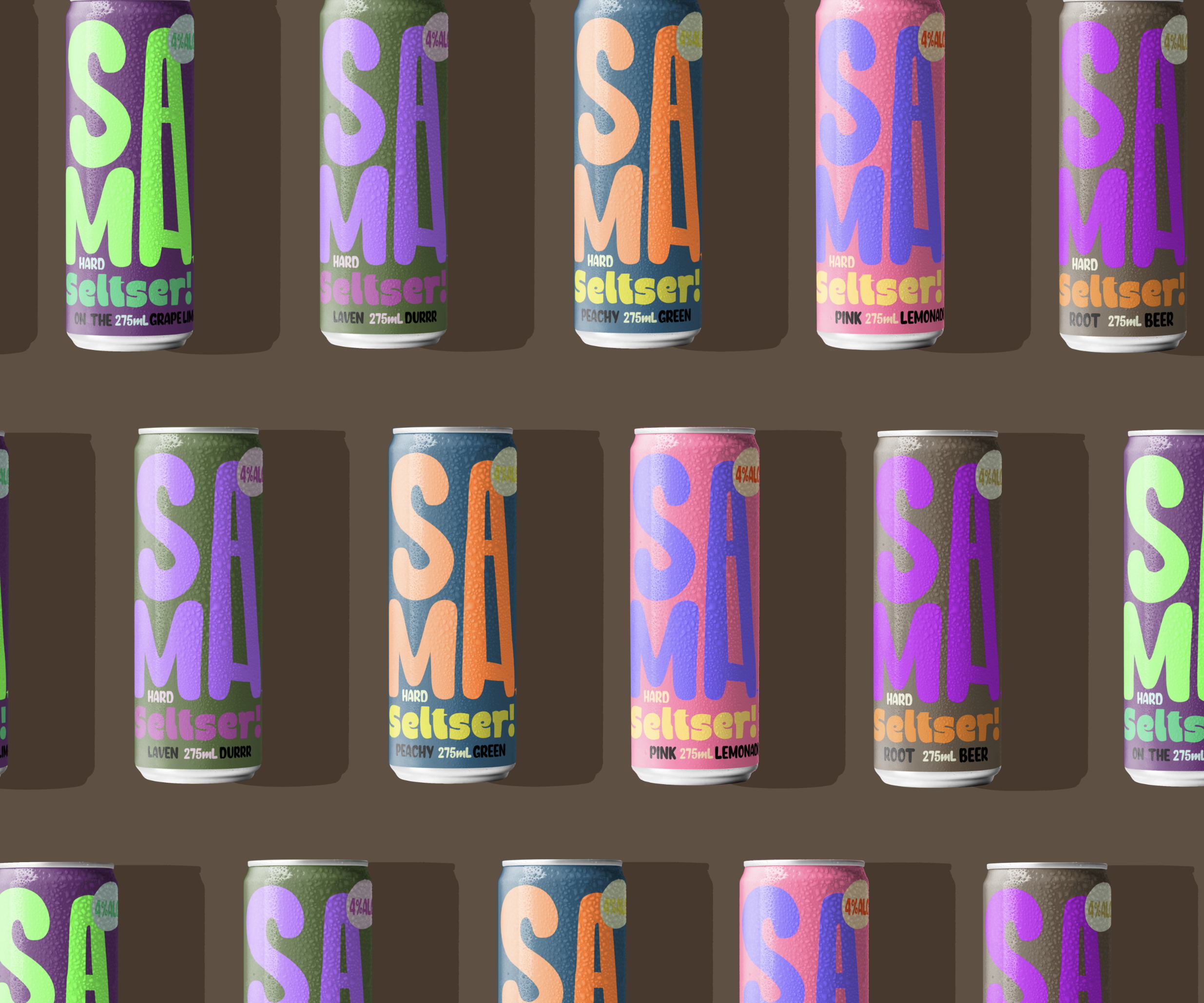
By just looking at the label, you would never use the word ‘hard’ to describe SAMA’s seltser, given the soft, rounded edges of the lettering. But that was Candy Brophy’s goal when conceptualizing this branding project. With a face like that—featuring a neon color palette and generally prolonged design—it’s no wonder SAMA Hard Seltzer is getting so much love. The creatively elongated letter A, meant to be pronounced twice, stands out and gives the design a quirky edge.
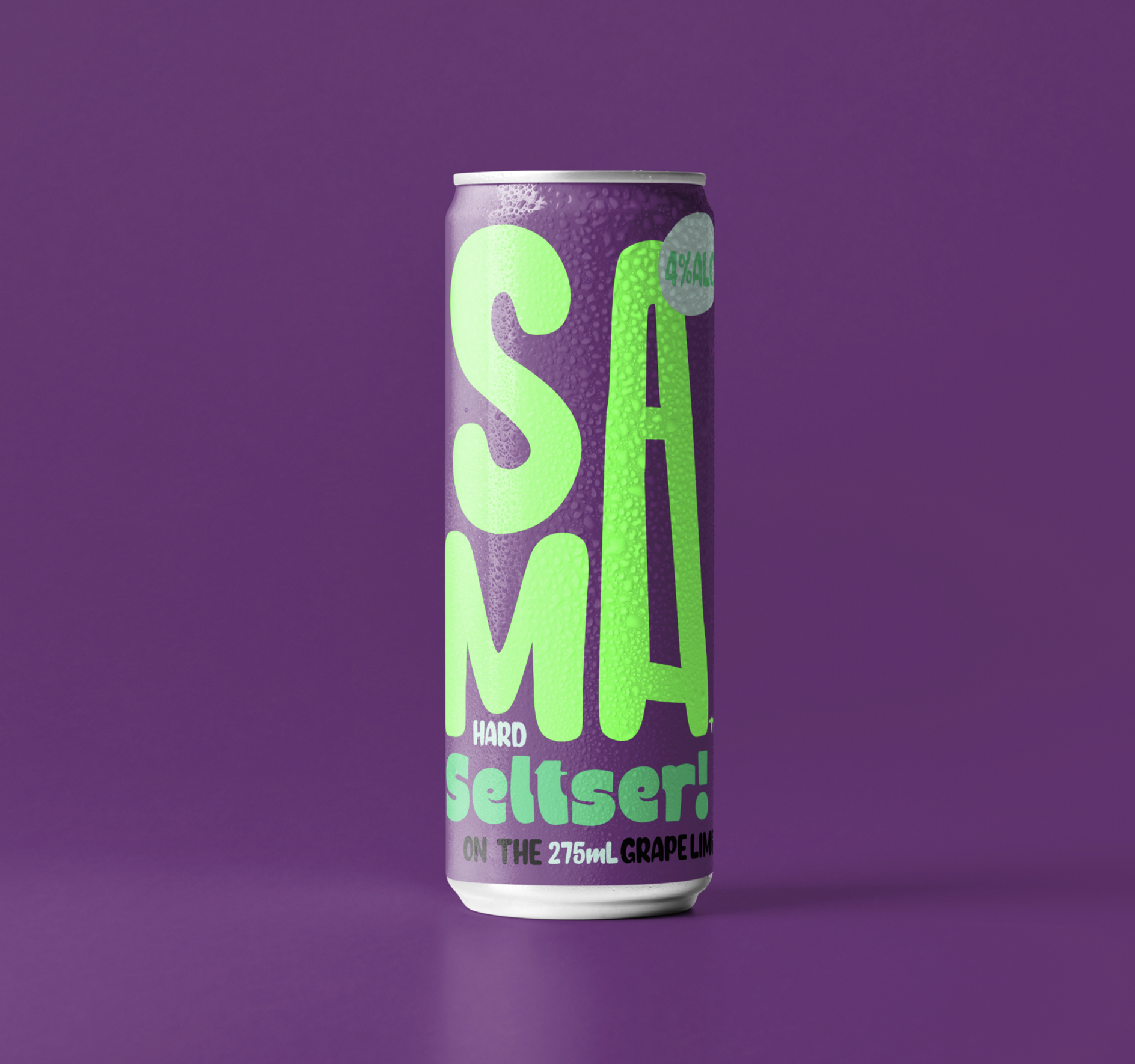
SAMA Hard Seltzer is an Aussie seltzer brand. In place of z’s, Australians often use the letter ‘s’. For this reason, the choice to spell seltzer with an ‘s’ resonates and translates better relative to the way we speak and spell. The random tangy flavors, paired with muted and neon colors, along with butcher shop graphics, make for an electric and eclectic drink range. We think it will be fun!


