Ingredients Matter Brings Powder To The People (It’s Laundry Detergent, OK?)
By
Published
Filed under
By
Published
Filed under
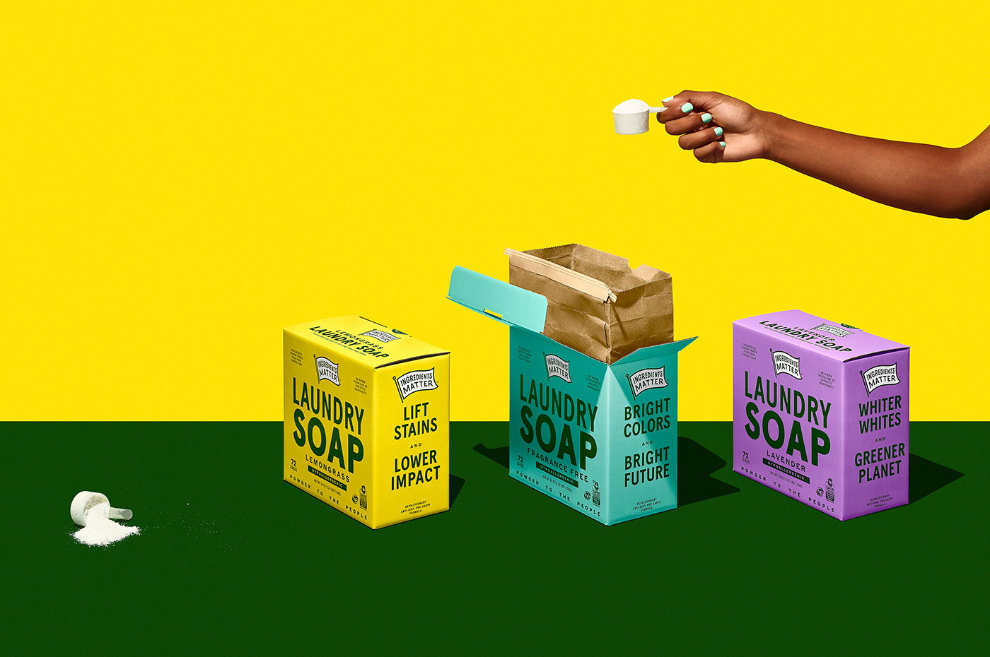
Ingredients Matter is a brand of natural cleansers that is soap-based and more effective than detergent. But they started to feel that the existing branding and packaging wasn’t telling its story in a captivating way.
The cleaning company’s products are made from natural ingredients and are free from dyes, synthetic or petroleum-based chemicals; since rinse water goes back into the environment, that means that the cleansers used also come along for the ride. They wanted to make that message central to the brand’s core, the kind of product that literally stands on its own soapbox.

Get unlimited access to latest industry news, 27,000+ articles and case studies.
Have an account? Sign in