Pack of the Month: ALEMBIQ Celebrates The Art of The Cocktail
by Bill McCool on 07/01/2020 | 4 Minute Read
Miss going to the bar and having someone else make you a perfectly-crafted Negroni? Sure, you can put your mask on and go to the liquor store, pick up all of the nerdy bartender accouterments you need for crafting a cocktail, but honestly, that’s just one more thing we have to do from home, and we're tired. So very tired.
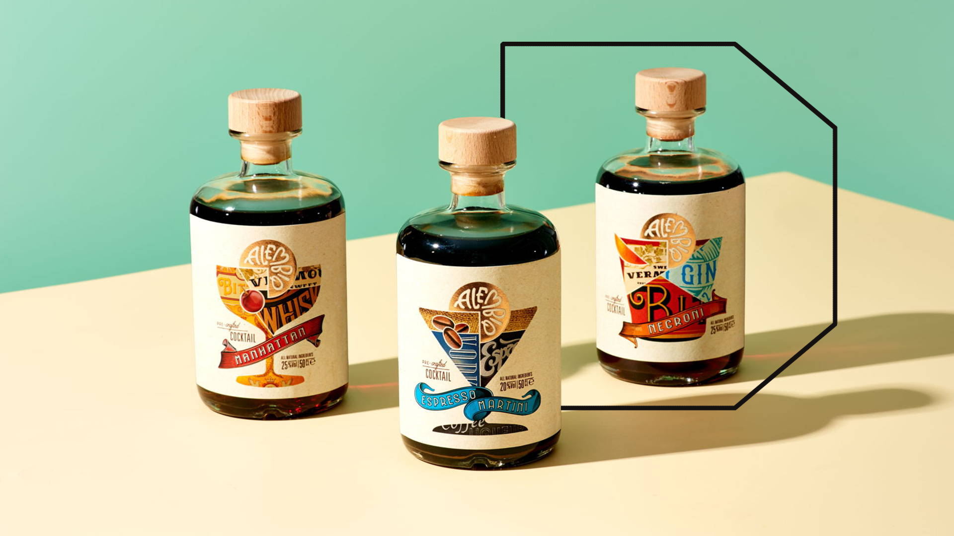
So, if you miss your local watering hole or speakeasy, ALEMBIQ might be the pre-mixed cocktail of your quarantined dreams. Turning to Amsterdam design agency Positivity Branding, ALEMBIQ sports an inspired piece of visual identity, incorporating the glasses one would use for a craft cocktail—the coupe for a Manhattan, a tumbler for a Negroni, or a martini glass for, yes, a martini—and fills them up with the packaging design labels for the ingredients that would typically go into those cocktails. Each premixed cocktail glass on the packaging gets served up with a garnish that comes in the form of the brand's logo, dialed up with a lustrous, metallic effect.
We spoke with Positivity Branding creative partner Gavin Arm about the classic cocktail look they managed to cleverly remix for ALEMBIQ, our selection for June's Pack of the Month.
Walk us through the design process that you went through for this project.
Quite early in the concept phase, our designer Marloes Oomen came up with the idea to represent the blending skills of a great cocktail mixer in a very graphic way, blending labels into the classic shape of a cocktail. It’s a very simple idea, and that’s its strength. As the client understands the creativity that goes into a great cocktail, it was something she could also get excited about, so we took it from there.
For the labels that make-up the serving glass on the bottle, were these pre-existing brands, or did you dream those up yourself?
We created them ourselves to give the right graphic cues for each spirit. They play such a vital role in the overall design, and it was important that each would be unique, but also feel authentic enough as a typical whiskey or vermouth.
What was one of the biggest goals you set out to achieve with ALEMBIQ packaging, and how did you accomplish it?
We set out to challenge the preconceptions of pre-mixed cocktails. The spirits that ALEMBIQ uses are all distilled in an urban craft distillery in Madrid, so that’s also highly creative, and brings a lot of character to the cocktails. The brand needed to reflect that creative character, and so we positioned it instead as "pre-crafted" to show that it’s not just blending a few spirits together, but really considered and unique.
How did you create the metallic effects on the bottle?
We chose Kurtz foils to replicate the copper kettles in the distillery.
What was the most challenging part of this project?
Each of the labels that are part of the collage needed lots of crafting to get the right levels of authenticity, yet they couldn’t be so strong they became the hero on the pack. That’s a fine balance to get right.
If you could pick one aspect of the finished design that you like the most or feel especially proud of, what would it be and why?
I think the way that the pack manages a fairly complex piece of storytelling in such an uncomplicated, elegant way makes us all at Positivity very proud of it.
Going the extra mile for a client is always, always worth it—as is defending your creative choices along the way. There was a huge amount of crafting that went into all the labels, beyond what was required, but you see it in the end result—a happy client—and beautiful brand.
- Designed by: Positivity Branding