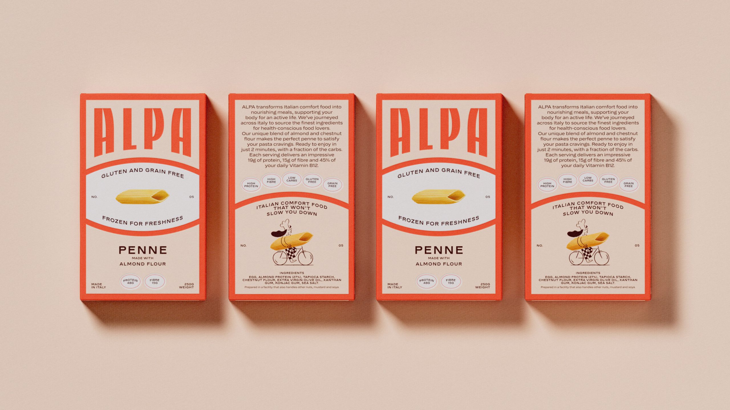
We don’t often see brands lead with design first if there’s a functional aspect of the product. Alpa, designed by Studio Tyrrell, shows that design-led functional food packaging is absolutely possible.
The box features a towering ALPA wordmark in a wide type that bleeds off the top edge. The aesthetic pulls from mid-century Italian graphic design and possesses the kind of typography you’d find on a vintage pasta brand from the 1960s.
At the center of the front panel sits an oval shape, an element borrowed from Italian label tradition, framing a single photorealistic penne against a clean white ground, which manages to feel both nostalgic and premium at the same time.

















