UP-UP’s Fair-Trade Chocolate Doesn’t Need Much More Than Good Type and Bright Colors to Make Statement
By
Published
Filed under
By
Published
Filed under
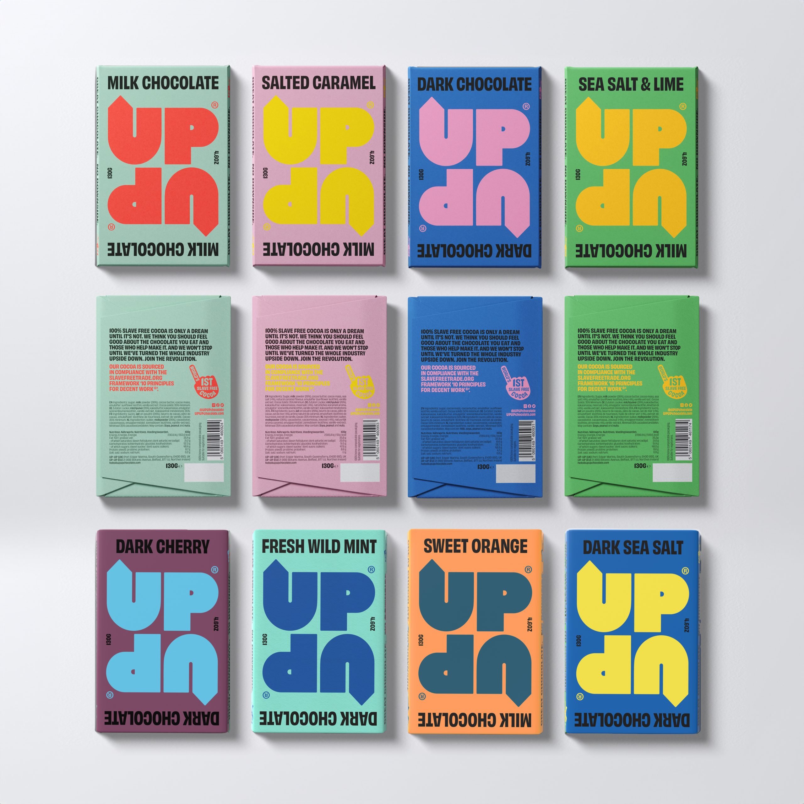
Any typography lover will tell you that sometimes a good word is all you need. Freytag Anderson has a knack for smart text, and they continue their hot streak with the design for Edinburgh’s UP-UP chocolate.
These appetizing sweets are able to capture attention without a lot of detail: just vibrant color palettes and a bubbly, dynamic wordmark, whose up arrows reference the fair-trade brand’s mission to “turn the chocolate industry upside down.”

Get unlimited access to latest industry news, 27,000+ articles and case studies.
Have an account? Sign in