Saucey Labels’ Packaging Sheds A New Light On Sauce Packaging Designs
By
Published
Filed under
By
Published
Filed under
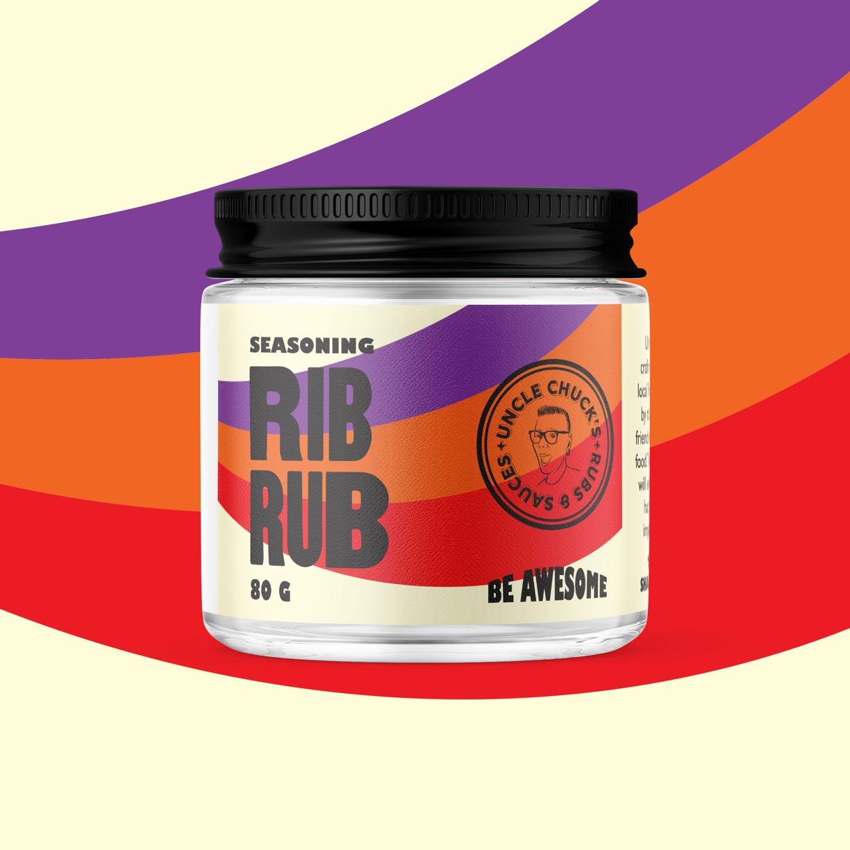
Condiment labels are a category known for their stability and tradition, but there’s definitely untapped room for playfulness. Eye Candy Design worked with Toronto-based Chef Cheryl Torrance to create labels for a constantly changing sauce line-up, and the result is an eclectically colorful design. Visualizing an almost anthem-inspired design, the labels feel full of pride and energy that the sauce industry has yet to see.

Chef Cheryl Torrance has been selling their ribs and sauces to the delight of their fans in her east Toronto neighbourhood, but was anxious to bring these out to further flung reaches of the province. We needed a label design system that can adapt to a changing product line-up. To counter the trend of black/white sauce labels, we created a look that would emphasize colour, happiness, and better engage the female consumer.
Get unlimited access to latest industry news, 27,000+ articles and case studies.
Have an account? Sign in