The panel of judges of The Dieline Awards 2014 have awarded R Design‘s Lily Lolo Redesign 2nd Place in the Health & Beauty category.
“Lily Lolo is a brand of natural mineral cosmetics launched in 2005 by founder Vikki Khan. The brand is sold online (Lily Lolo website, affiliate sales, Amazon), wholesale distribution (250+ independent UK stockists which are mainly salons) and via International Distributors (in Japan, Sweden, Poland, Denmark, USA, Slovenia).
The brand has achieved a cult following due to its expertly formulated range of high-performance, natural, mineral make-up essentials. The products are not tested on animals. They are free from chemicals, dyes and fillers and work with the skin’s natural tones, so customers achieve a natural looking flawless finish every time.
However an identity overhaul was needed in response to customers’ expectations of a more exclusive and luxurious look and feel for the brand. The brand overhaul needed to embrace all aspects of the brand’s visual identity from packaging to print and digital off–pack communications.
Lily Lolo’s direct competitors include brand’s such as Bare Minerals, Bella Pierre, Everyday Minerals Jane Iredale, Sheer Cover, Bare Faced Beauty, as well as the cosmetics market as a whole.
Lily Lolo Mineral Cosmetics are created with 100% natural ingredients and do not contain any Parabens, Bismuth Oxychloride, synthetic dyes and exclude the use of nano-particles.
R design helped to realign Lily Lolo’s brand positioning, targeting active, conscientious young women who want to achieve a flawless natural look without the use of harsh chemicals or unnatural ingredients.
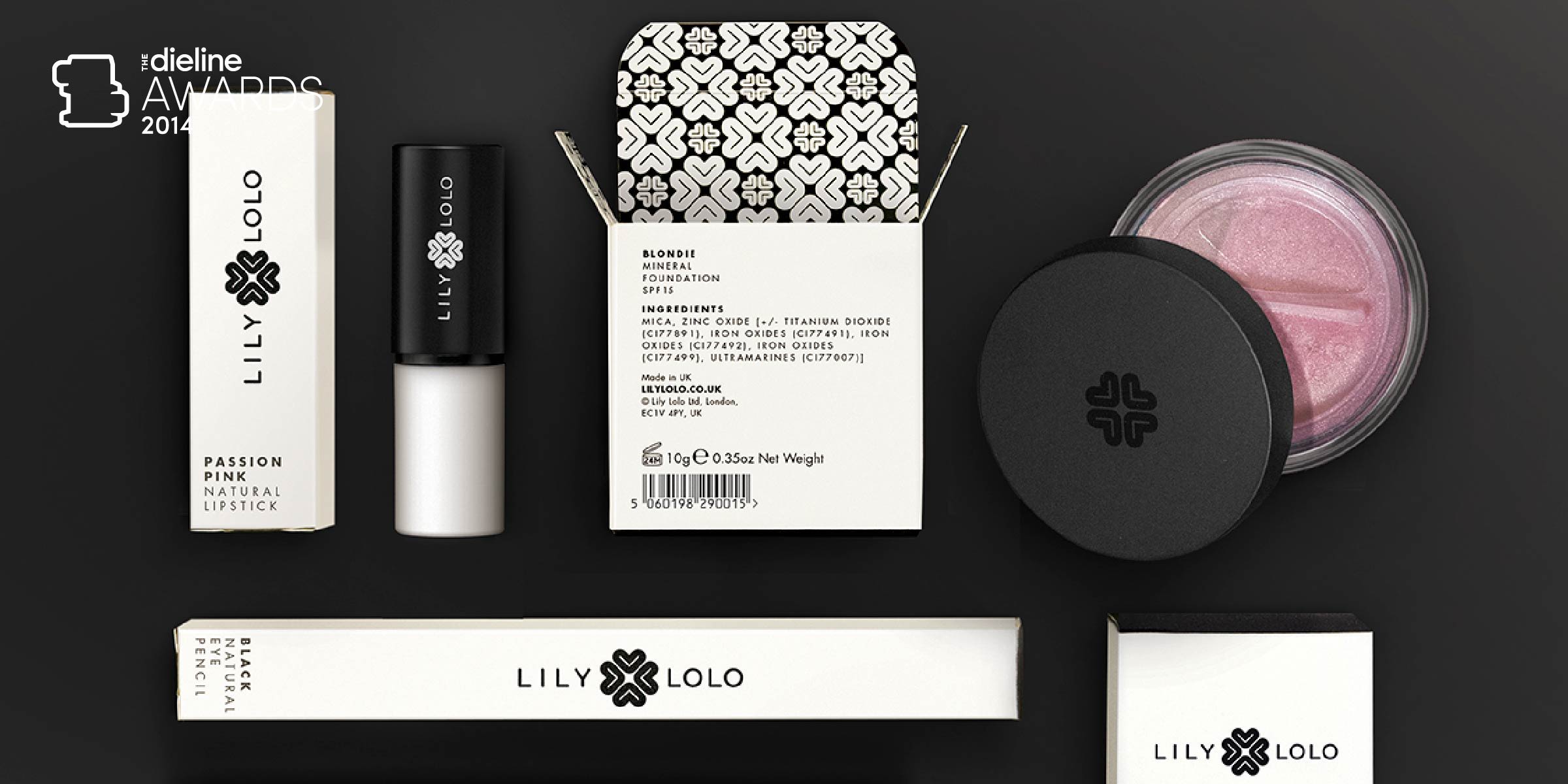
A new identity was created to more accurately reflect Lily Lolo’s qualities and give it a more stylish and sophisticated feel whilst retaining the innocence and approachability the brand is known for. A monogram based on the ‘L’ of Lily Lolo was designed as an integral part of the identity. It is reminiscent of a floral motif and a heart shape that serves to symbolize the brand’s natural credentials and legendary customer care. The monogram also forms a unique repeat pattern that is used on the inside of packaging and in off-pack applications.
All aspects of the brand’s identity have been re-vamped including style of photography, tone of voice, website, digital campaigns, packaging, POS and other off pack communications.
Brand guidelines were created specifying all the visual expressions of the brand. Artworks for the main product SKU’s were also produced. “