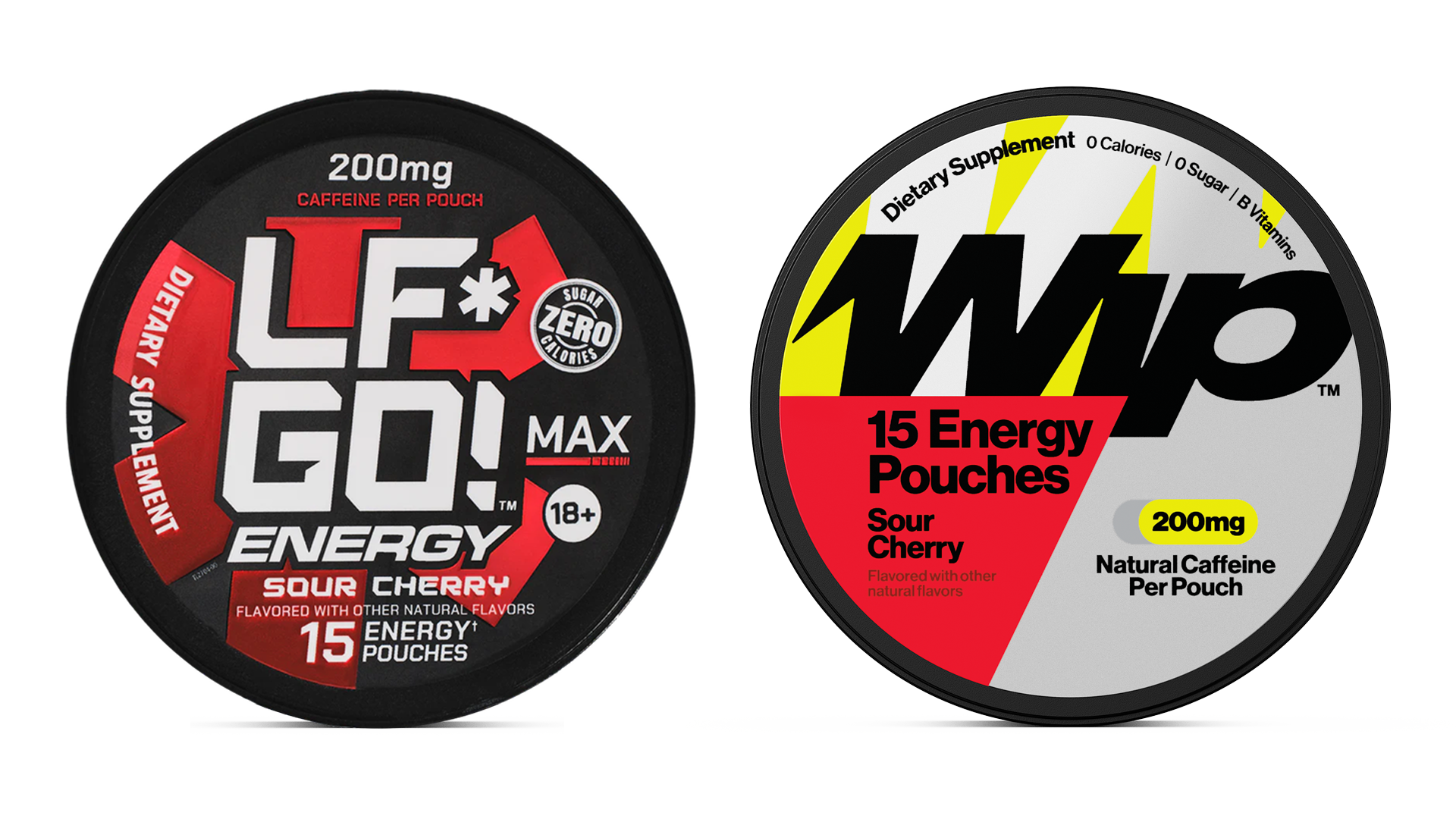

George partnered with Wip [formerly LF*GO!] to create a brand built to move at the speed of its product. In three months, they delivered a globally trademarked name & identity, packaging system, and launch that made Wip the #1 energy pouch in America.
George partnered with Richard Mumby just as he became CEO of LF*GO!, an energy company with moderate success selling caffeine pouches on Amazon. The products had potential but lacked a cohesive brand, scalable identity, and shelf presence to match the leadership team’s ambition of becoming the leading energy brand on the planet.

Transformative Brand Overhaul
George led a full brand transformation. In less than three months, with support from a world-class team of designers—Max Olsen, Dominic Liu, Esther Mun, Greer Mosher, and Rhea Alberastine—Wip was born. A globally trademarked brand, Wip redefined how an energy company could look, feel, and communicate. The team managed every aspect of the project, from naming, brand identity, and creative strategy to product mechanicals, prototyping, and printing, ensuring every detail aligned with the brand’s mission.
The name Wip draws from multiple threads: the crack of a whip, energy in motion; the idea that we are all a work in progress; shorthand for the pouches themselves; and the playful vernacular of “whip” or “whup” as tackling a problem. This multi-layered concept shaped the logo, visual language, and packaging, giving the brand narrative, personality, and flexibility to scale across products and markets.

The initial launch included cans and pouches in multiple strengths and flavors. Each SKU was designed with clarity and personality.
Color palette: Led by Wip Yellow, a high-voltage hue that radiates energy and ensures instant recognition. Gray and Black provide grounding, while flavor cues create bold pops.

Logo: The Wip Wordmark visualizes dynamic forward movement inspired by a whip, fused solid and sharp to embody badge-like strength. Metallic elements convey premium quality and stand out on shelf.
Typography: Neue Haas Grotesk Display Pro is applied deliberately to balance clarity and flexibility, communicating both the scientific qualities of the product and the brand’s bold, declarative tone.
Visual hierarchy: Layouts, iconography, and typographic treatments prioritize functional information while supporting playful, energetic branding.
System coherence: Bold graphics and dynamic layouts reinforce Wip’s approachable, confident, and premium identity across online platforms, retail shelves, and marketing materials.


George next acted as Wip’s in-house creative team, producing comprehensive brand guidelines covering tone, visual identity, and packaging standards. Guidelines ensure consistency while leaving room for iteration. The team supported recruitment of a full-time creative staff to extend the brand, produce new products, and grow Wip’s presence in retail and digital environments. George continues as a strategic creative partner, helping maintain a coherent vision as the brand evolves.
From landing the name to seeing newly designed products in-market took less than three months. Within six weeks of launch Wip achieved:
Packaging balances clarity with personality, energy with premium presence, creating a human, approachable, and aspirational brand experience. Each piece tells a story—from functional caffeine content to playful brand attitude—without sacrificing readability. Inspired by contemporary design culture with nods to nostalgia and playfulness, the packaging is unmistakable, communicates quality, and engages consumers at first glance.
Wip exemplifies a full-spectrum approach to branding: naming, identity, product system, retail design, and creative storytelling. The collaboration between George, the design team, and Wip’s leadership produced a cohesive, scalable brand that communicates ambition, energy, and playfulness. From ideation to global trademarking, prototyping to retail rollout, every step reinforced the vision of a premium, playful, and modern energy brand. Wip Energy stands as a flexible, high-impact brand capable of growth across categories and geographies, demonstrating how inspired design and integrated execution can transform a functional product into a brand with presence, personality, and potential.