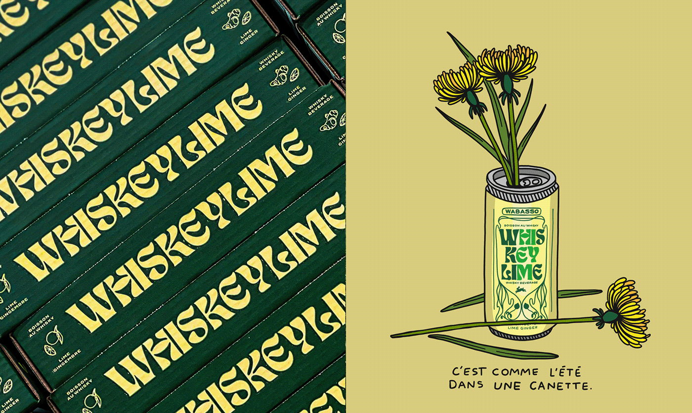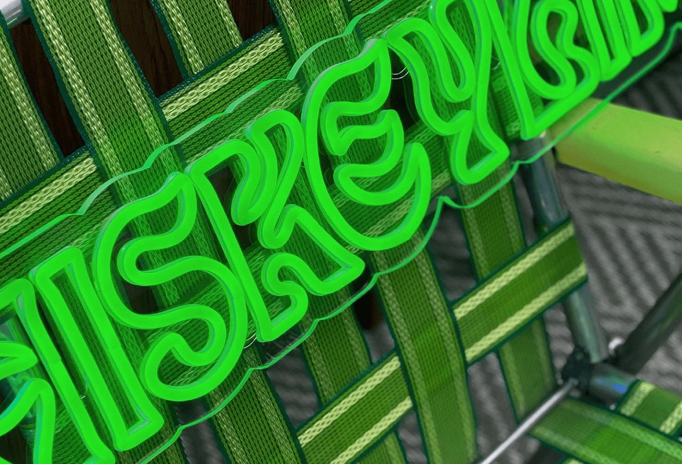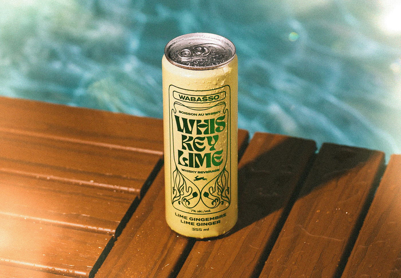
We’ve seen art nouveau styles take over the design and packaging space lately, but Carolane Godbout Isabel and Chri Bou from Acolyte’s packaging design for Whis Key Lime concept taps directly into it. The gorgeous typography and citrus-inspired color palette work wonderfully with the brand’s cunning approach. The play on words, the stylish type style, and welcoming colors are all classic elements that, when placed together, create an entirely contemporary aesthetic. Plus, anything that tastes like key lime is a win in my book.