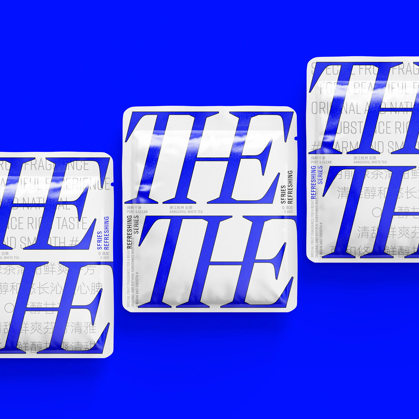
Tea packaging can often err on the side of dainty. Think Bridgerton meets floral boutique. Yet, The is a tea brand with packaging designed by Hesign that’s switching things up. Utilizing typography in a highly graphical way, the packaging is confident and bold. Further, the color system is just as proactive as the type, creating a brand that’s clearly not shying away from making a statement.
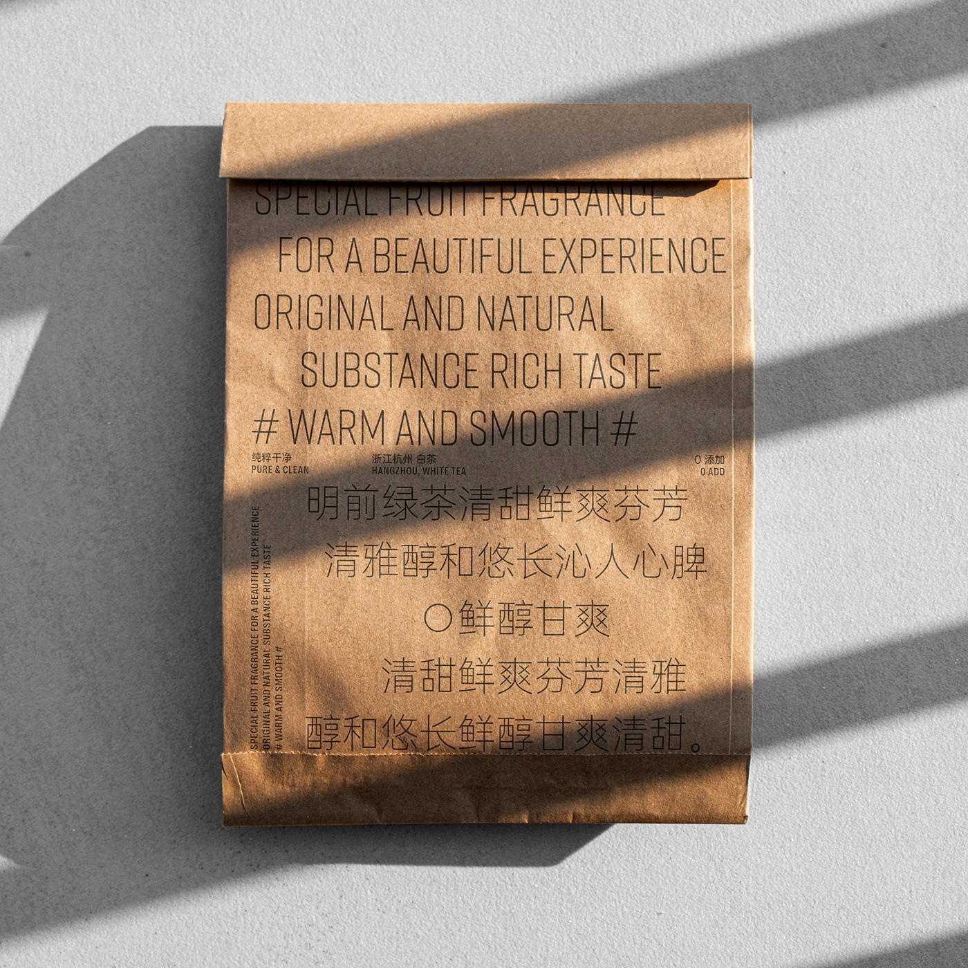
THE TEA TIPS hopes to help consumers maintain their daily tea drinking habits, using “THE” to emphasize products, every bag of tea is worthy of being called “THE”, every bag of tea is worthy of being emphasized, and it is worthy of playing an important role appear in the daily life of consumers. The designer uses a very graphic font design to make the brand name present a neat geometric outline, so as to achieve the symbolic purpose of making the logo easy to recognize and remember.