
Derek&Eric crafted the packaging design for Really Good Beer Society’s Root Cause, breaking free from the sea of activist beer brands that only talk the talk. With a B Corp certification validating their commitment, Root Cause’s packaging embodies a joyful optimist persona, reflecting the brand’s actions. The logo, an endlessly revolving wheel of color and typography, is the cornerstone of a branding system that balances kinetic energy with precision. Designed for high-end bars and hotels, the presentation is a visually appealing and purposeful choice for consumers.
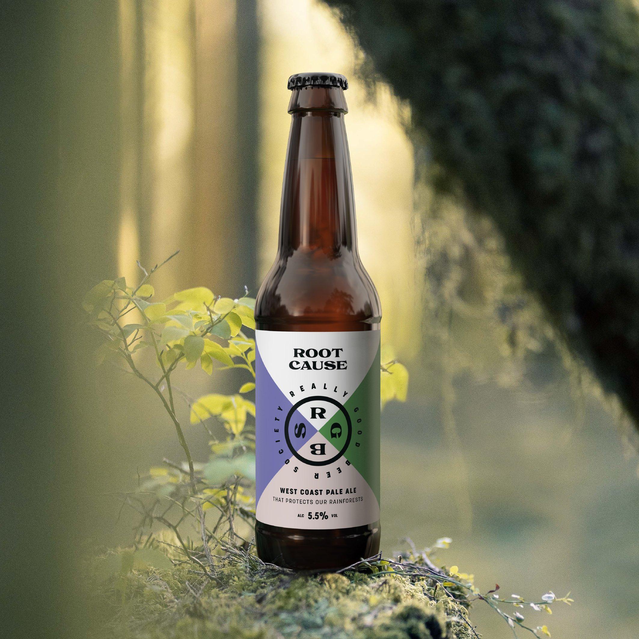
The craft beer category is awash with activist brands, who talk a good game but fail to live up to the hype. Really Good Beer Society breaks the mould by actually doing what it says on the tin – brewing great beers that give back (with a B corp certification to prove it). And with a strategic focus on high end bars and hotels, our design also needed to feel at home in a world of cocktails and canapés.
















