Telegraph Hill Gets a Red Hot Redesign and Ditches ‘Olive Oil Green’
By
Published
Filed under
By
Published
Filed under
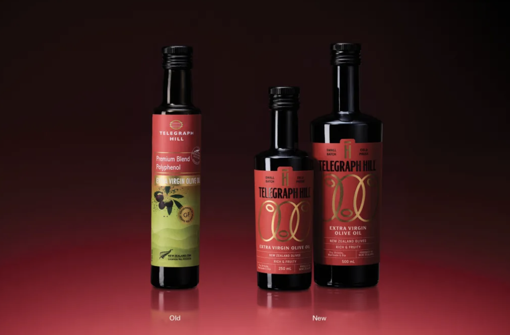
Telegraph Hill’s Refresh update by Onfire Design transitions from polite specialty food to a new packaging system that demands authority. The previous packaging was busy, but the new system pares back information and turns to bold, vertical typography with generous spacing.
A red base anchors the design, while gold linear motifs reference olive branches and flow without illustration heaviness. Dark secondary labels add hierarchy. The result is premium and confident, and let’s be honest, the last thing we needed was another green olive oil packaging system.
Get unlimited access to latest industry news, 27,000+ articles and case studies.
Have an account? Sign in