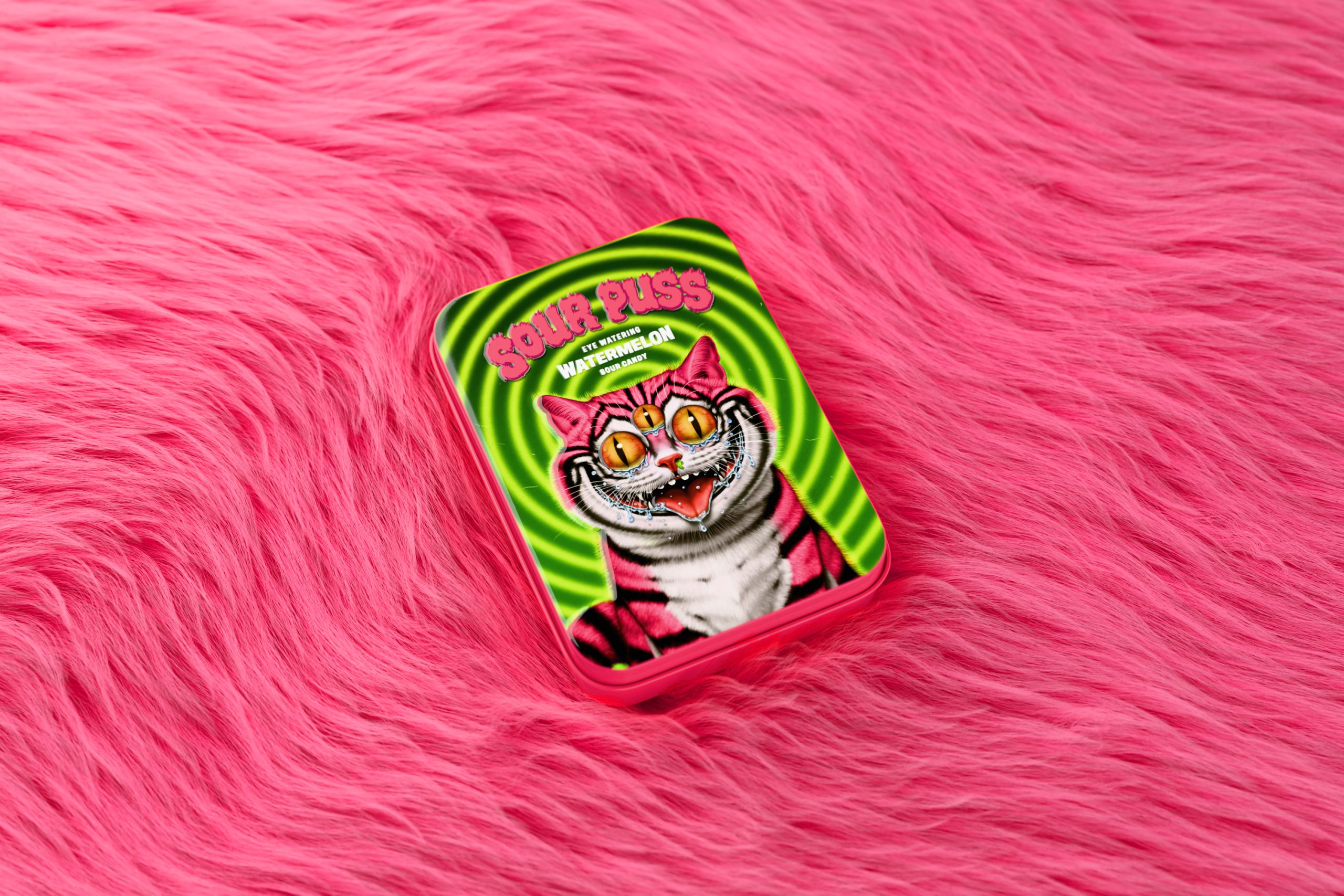
Studio Unbound’s packaging for Sour Puss sits somewhere in the crossover of a punk sticker pack and a sugar-induced hallucination. The metal tin features a bug-eyed, neon-pink cat, complete with acidic tears.
It’s a bold nod to the candy’s watermelon sour punch. The warped green backdrop amplifies the chaos, while the typography is all-caps, puffy, and aggressively pink, locking in the cartoon-anarchic tone. It’s hard to miss, harder to forget, and designed to blast straight off the shelf.