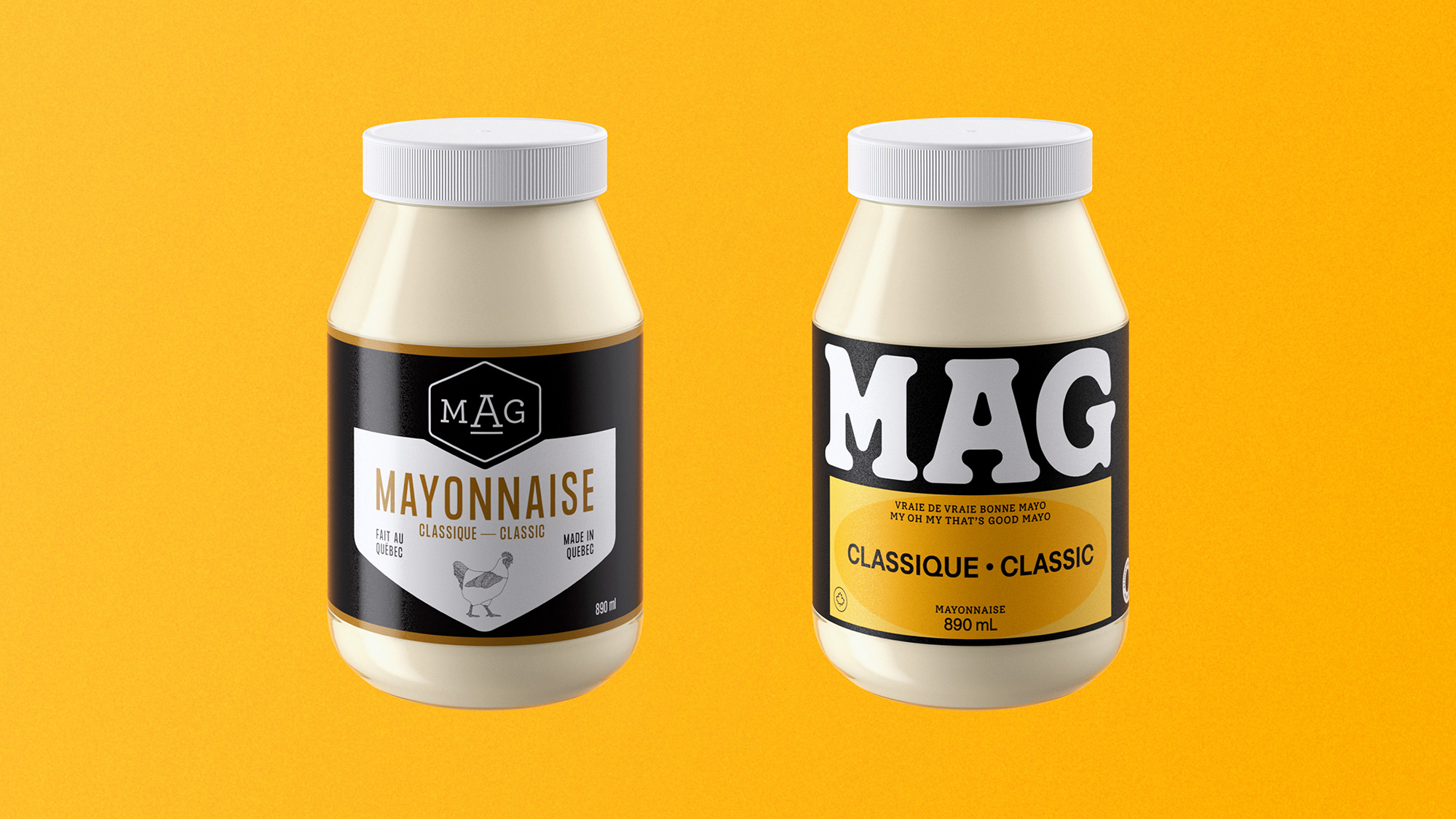
LG2’s work for MAG expertly explores bold typography as the principal design element. Oversized letterforms take over the labels without overwhelming, and they’re cropped and stacked like zine headlines.
Color blocking does the rest with flat, high-contrast fields that make each flavor legible from across the aisle. The system feels closer to editorial layout, rejecting food clichés in favor of graphic confidence that stands apart from the script fonts and pastoral cues crowding the category. It’s sauce with flavor both inside and on the packaging.
Besides, who needs a picture or an illustration of ingredients when the sauce can do the talking beyond the label?

From LG2:
MAG is a Canadian sauce and mayo company. Convinced that the taste of its products could compete with the best in its category, MAG set out to refresh its identity by creating a brand image that is accessible, bold, and that stands out on grocery store shelves.
Its graphic system adapts across product lines, packaging, and product types: each flavor is represented by a unique color and shape. This redesign not only helps the brand stand out on the shelves, but also supports its expansion into grocery stores across the rest of the country.