Marco Arroyo-Vázquez’s packaging concept for Casajús showcases a refreshing departure from the ordinary, infusing the brand’s rosé with a playful and vibrant aesthetic. The bottle’s clear label serves as a window into the wine’s essence, reflecting the brand’s transparency. Drawing inspiration from the wine’s floral and fruity intricacies, the “gummy bear” motif becomes a clever metaphor for capturing and containing the essence of trapped fruit flavors while mirroring the wine’s lively and sweet nature. This design encapsulates the sparkling and cheerful nuances of the rosé, allowing its brilliance to shine through.
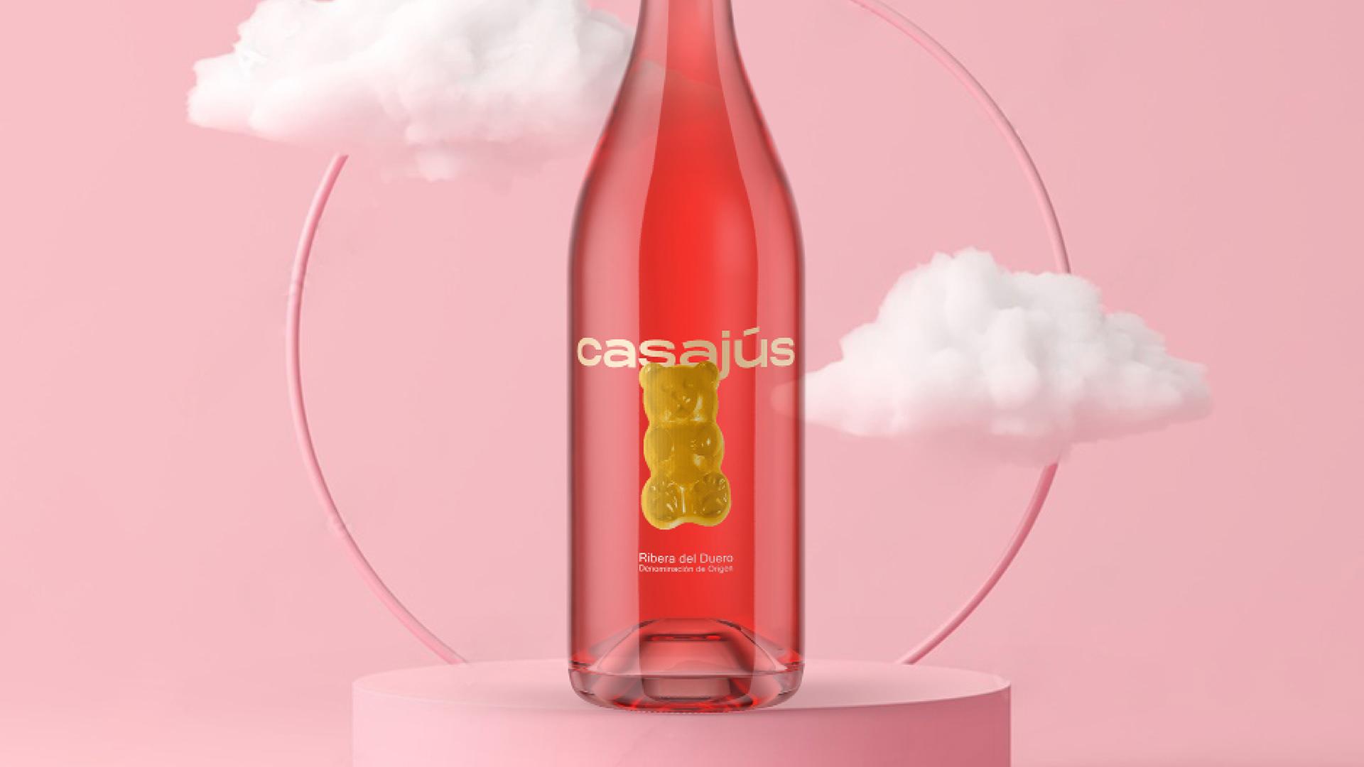
Bodegas Casajús (Quintana del Pidio), located in the Ribera del Duero D.O. wants to give a different, fresh and fun touch to its bottle of rosé. “The wine rosé itself is a wine with a lot of floral and fruity nuances, I don’t know, sparkling, let’s say, with cheerful nuances and a tendency to be sweet”. The “gummy bear” is a metaphor for “trapped fruit flavour. It is also a representation of the bright nuances that characterise wine. The design is transparent label design for honesty, if we have a good product, the most honest thing to do is to let it to let it be seen with all its nuances.