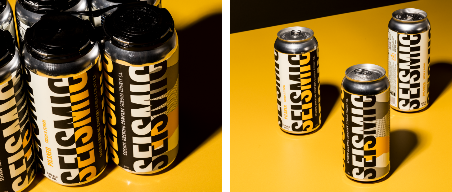
BRIGADE’s packaging design for Seismic Brewing reflects the brand’s commitment to environmental sustainability and innovation in Northern California’s craft beer scene. Faced with a crowded market and the need to stand out, the design cleverly avoids the melancholic earthquake connotations, instead using vibrant colors and patterns to create optical illusions that captivate consumers. The wrap-around label with strategically placed black and white elements, accented by SKU-specific pops of color, generates a dynamic “vibration” effect. Inspired by aerial views of Northern California farmlands, the conceptual patterns pay homage to the environment.

Seismic Brewing, a Northern California craft beer pioneer, tapped BRIGADE to develop a redesigned packaging system to better communicate their dedication to environmental sustainability. Driven by drought conditions and harnessing the elements of the brewing process, Seismic Brewing is paving the future of how beer is made, and they needed a can to tell this story. Winning at retail was also critical. A crowded shelf and an abundance of heavily illustrated labels in the microbrew space were overwhelming and difficult to navigate—a key lever to pull for their repositioning.