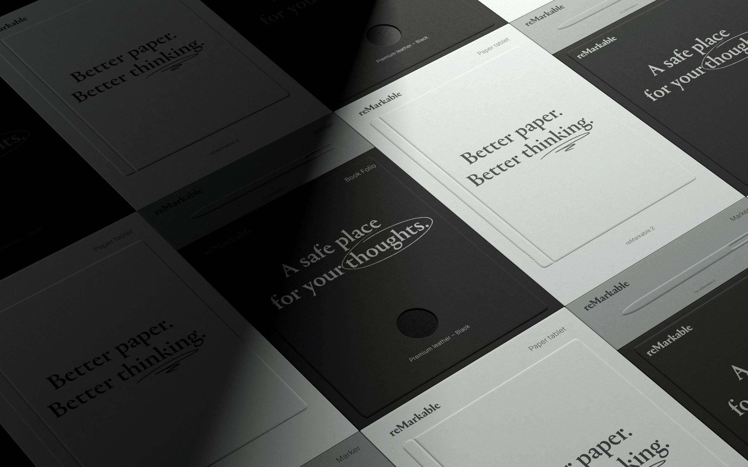
The copy-forward design for the reMarkable 2 packaging is a sleek, minimalist marvel. Designed to captivate the consumer, this packaging features slight debossing elements that give the design a tactile feel. The timeless typeface is used strategically to make the consumer think about the intentions they’ll use the product with. For example, “a safe place for your thoughts,” is indicative of the ability to use the tablet to write down your thoughts, uninterrupted.
The color pallate used across the brand are various sage greens, and rich charcoals, giving the packaging an adult and sophisticated feeling.
With reMarkable 2, the distance between you and your next great idea is paper thin.