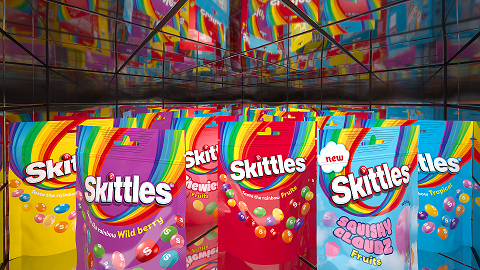
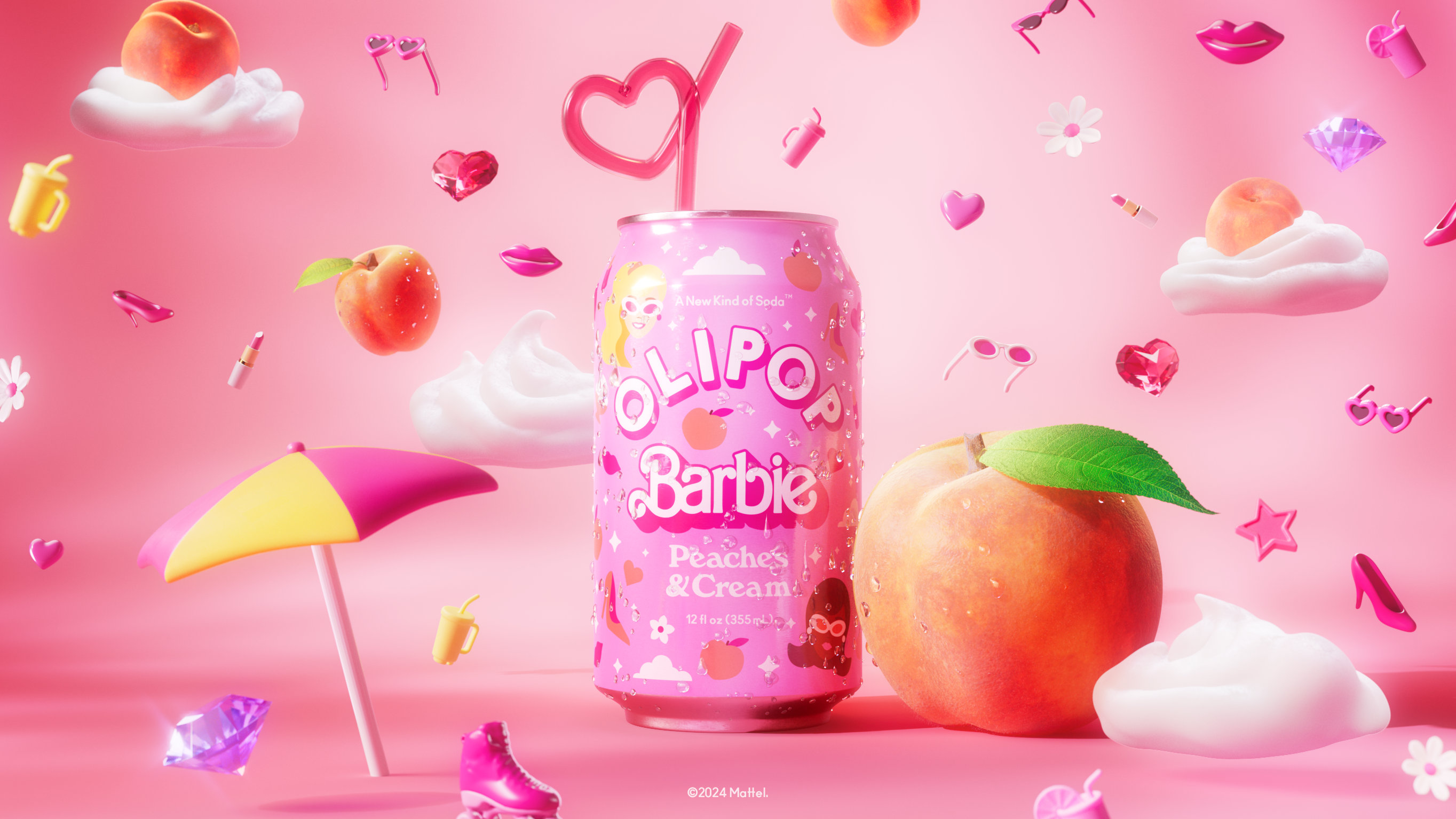
Maximalism has been huge to the point of almost feeling inescapable for the past few years, and while it’s been nice to have more color and fun, let’s be real—sometimes it’s overwhelming, and there’s always a good case for keeping it simple.
L.A. agency Nice People makes a great one in their work for bath and body brand Public Spirit, an understated, unpretentious design that feels in line with the kind of anti-branding a lot of eco-friendly labels have been doing for the past few years. It features good ol’ black serif text on an accessible, off-white background, saying nothing more than what you need to know: what the product is, what’s in it, and of course, who made it. Public Spirit’s logo stands out with big, bold letters, but doesn’t hog too much of the spotlight, letting what’s inside the bottle speak for itself.