Radeberger Becomes the Strong, Silent Type of Beer with Their Classy, Understated Redesign
By
Published
Filed under
By
Published
Filed under
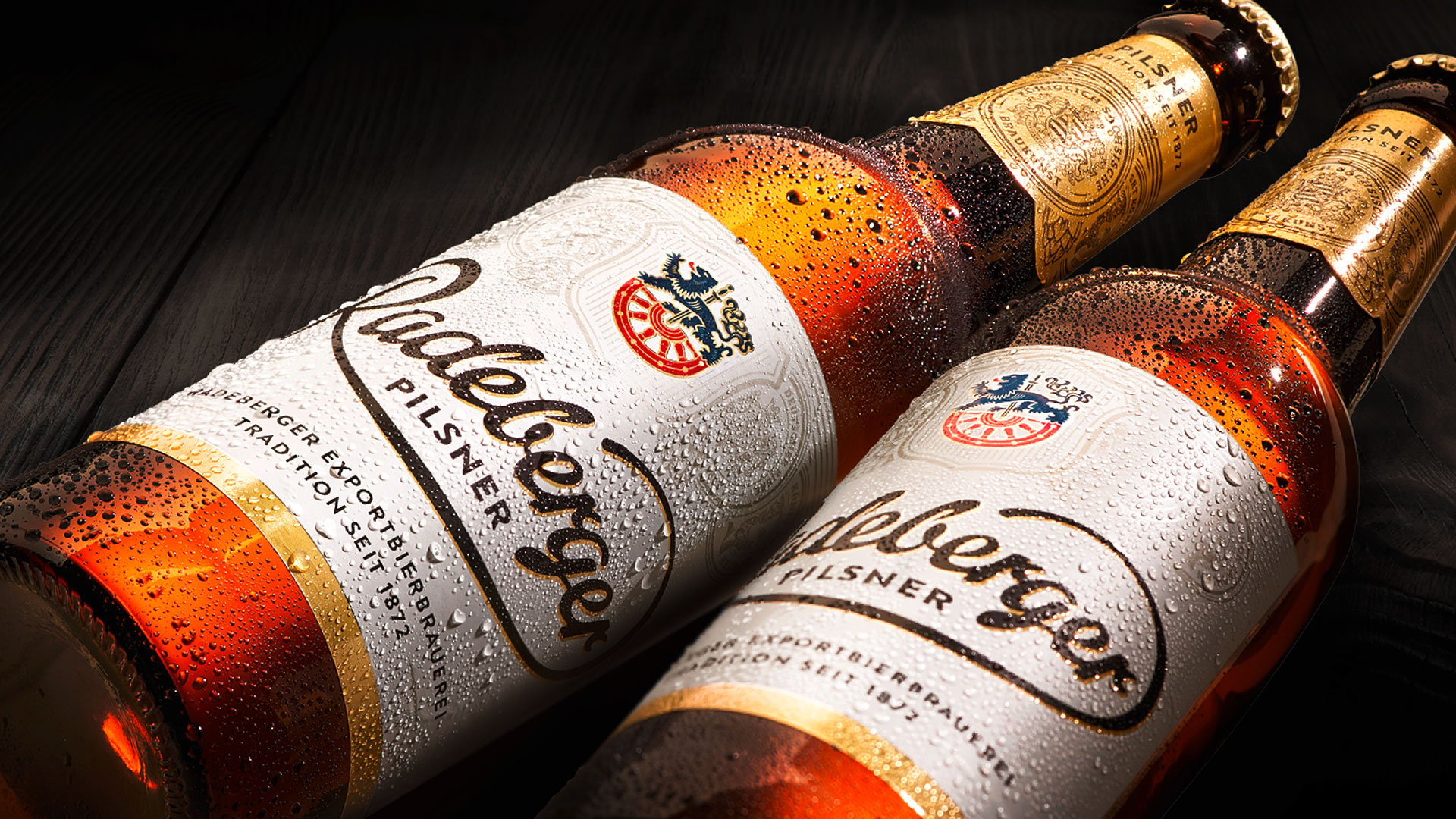
While we saw a massive pendulum swing from minimalism to maximalism over the past few years, it feels like the past year or so has been about finding the center again. There’s a strong thread of brands adding elegant touches like gold and ornate symbols to their packaging, but it has to be the right balance.
The classic German pilsner Radeberger found it with the help of Higgins Design, who simplified their bottles while holding onto just the right amount of flash. While the logo used to be entirely gold, it’s now more of a shadow, which adds a quiet glamour to the label. Typography switches from serif to sans for a look that’s slightly less old world, while an adjustment to the brand’s coat of arms keeps that iconic legacy look.

Get unlimited access to latest industry news, 27,000+ articles and case studies.
Have an account? Sign in


