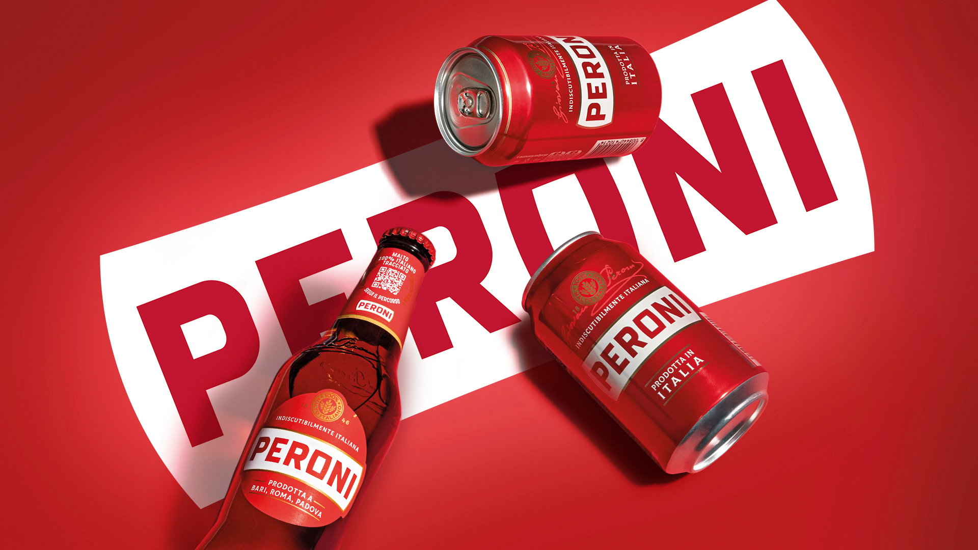
The light, easygoing Italian beer Peroni is a classy late-night staple, best known for its striking green bottle. There’s always been an old-school European charm to the original design: classic primary colors, a refined serif logo, and an elegant seal surrounded by a blue ribbon. There’s a vibe that makes it feel a little lost to time, which is fun for evoking an old, family-owned European dive bar vibe—but not especially helpful in an increasingly competitive vertical. Beer design has really been on its A-game lately, and the brands that keep up tend to be rewarded in kind.
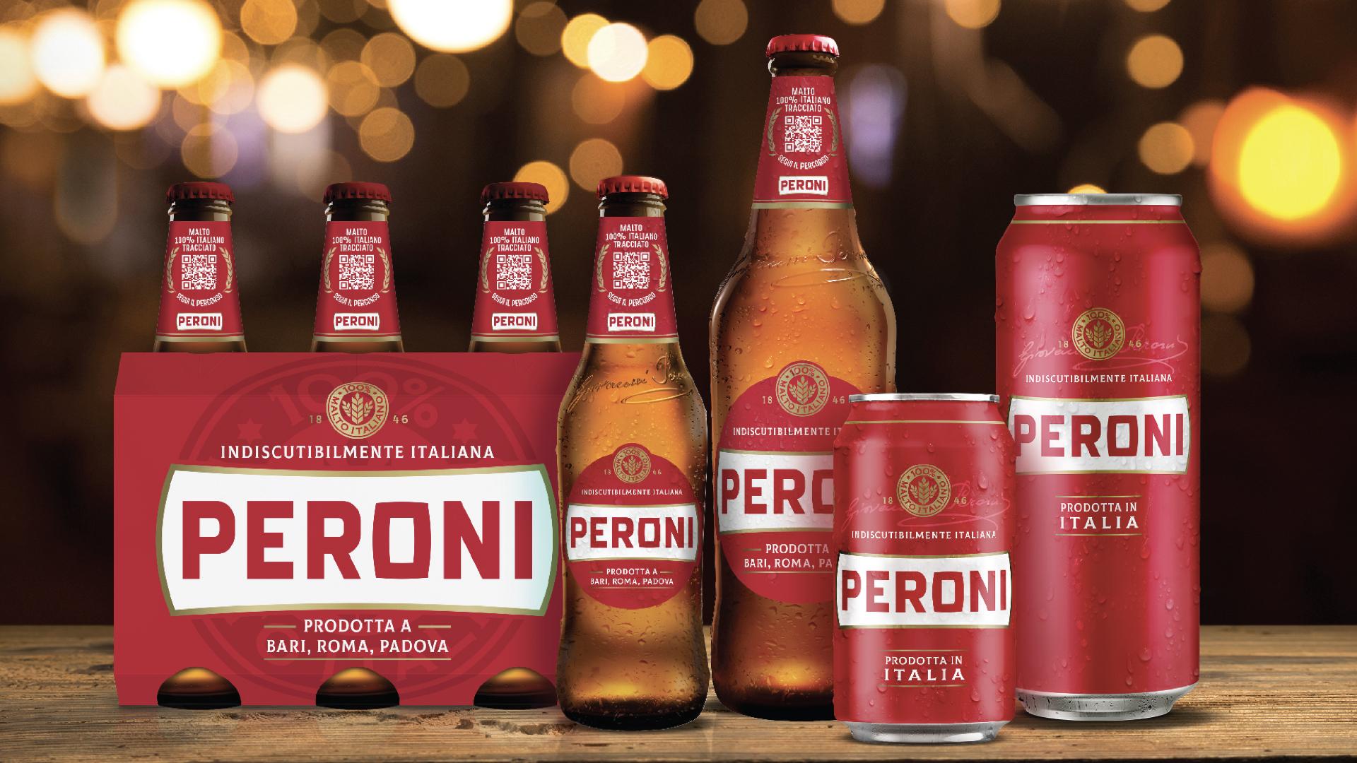
Thankfully, the Milanese drink experts at Smith Lumen stepped in with a sleek new look that still plays to its old-world flair but makes perfect sense standing alongside more modern brands. Peroni’s redesign ditches the serif for a logomark that’s less Helvetica and more midcentury Italian liquor poster, a vibe that’s felt especially trendy lately. The resulting banner gives the brand a look that feels perfectly aligned with current aesthetics, but is understated enough to outlast the fickle whims of the modern trend cycle.


1 response to “The Iconic Italian Beer Peroni Gets a Classy New Look from Smith Lumen”
Oof it feels like a degradation and mistake to ditch the green bottle? Plus the old label was much more elegant…. It feels like a low-cost supermarket beer now.