B&B Studio has refreshed the packaging for Pip & Nut, the UK’s fastest growing all-natural nut butter brand, created by the agency back in 2015. The new look rolls out across the range from this month, and uses bolder iconography and pops of colour to create greater product differentiation across a growing range of innovative flavours.
Clear ingredient iconography has been added front and centre to help call out some of the brand’s USPs, such as ‘Always high oleic peanuts’, while back of pack icons for recipe ideas and ‘Pip’s Top Tips’ build on the brand’s flair for flavour and fun, as well as encourage consumers to experiment in the kitchen with nut butter.
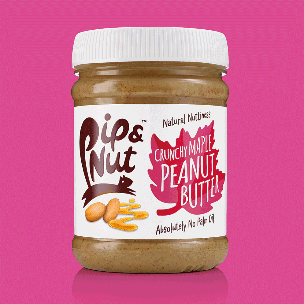
The Pip & Nut logo still remains the brand’s boldest asset on pack, but the injection of colour, as a marker of each flavour, helps the products stand out even more among its more traditional-looking competitors.
The range of new and improved design will also be rolled out across shelf-ready packaging and point of sale materials to further maximise its effectiveness.


