
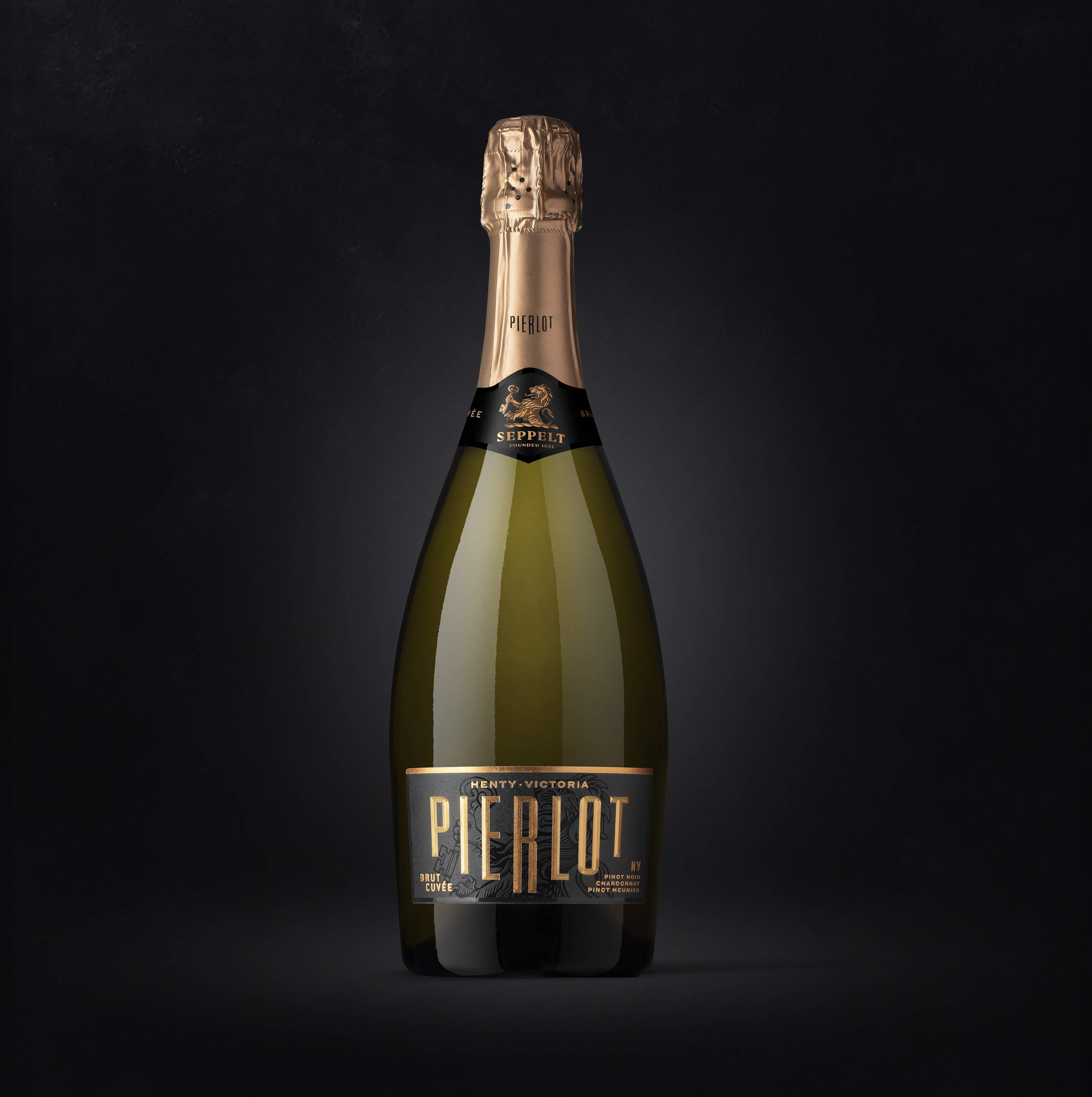
Pierlot’s packaging system, designed by Denomination, reimagines the classic elements of sparkling wine. The black label helps accentuate the elegantly gilded logo, and the contemporary typeface is modern while also creating a playful nod to an art deco inspiration. The foil color of the Brut is a bronze-gold color, while the Rosé has a pink foiling in a similar hue, a visual nod to the flavors within. Additionally, keeping the label so low on the bottle allows the bottle’s soft curves and elegant forms to truly shine.
What was the opportunity or challenge that the client was trying to crack?


