Dozen Agency’s packaging design for Haisenberg’s new filter lager is a masterful blend of modern gothic typography and traditional European aesthetics. The intricately carved and cut logo sets the tone for the brand’s identity, drawing inspiration from the classic beers of Belgium, the Czech Republic, and Germany. The minimalist, vintage, and modern design mirrors the beer’s well-balanced taste, drinkability, and density characteristics. Further, the blue background exudes restrained premium, symbolizing the reliable and eternal nature of Haisenberg.
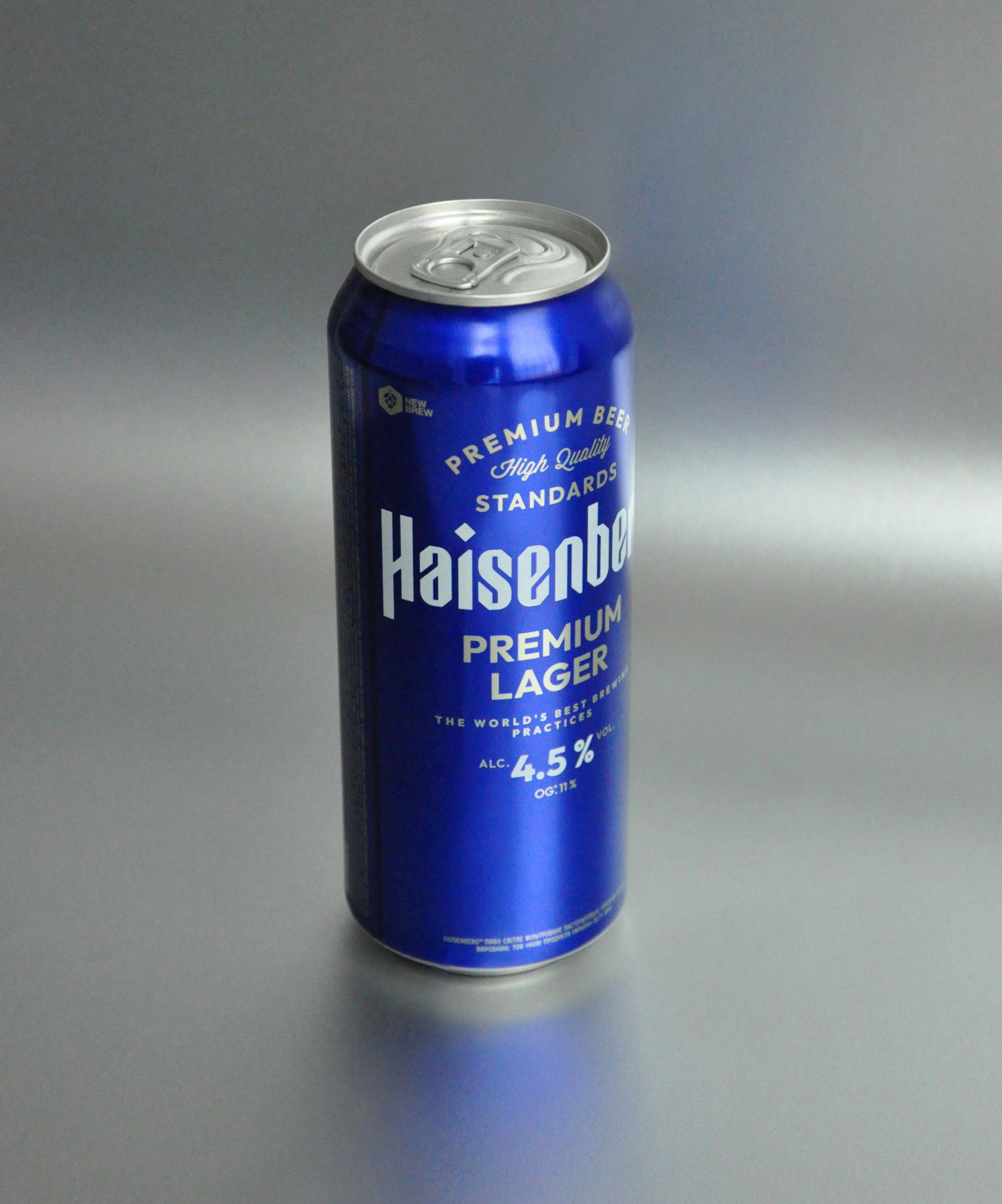
NEW BRAND HAISENBERG filter lager is a new addition to the beer portfolio of New Products Group. The project was developed in two stages. First, we created a logo, identity, and labels for the European-style unfiltered craft beer of the same name, as well as a line of flavors in metal kegs. And the next important step was the launch of the brand in bottles and cans in a wide retail network. A BIT OF MODERN GOTHIC in typography became the basis of the logo, in which we allowed ourselves to carve and cut each letter.