- S&Co creates a typography driven identity for Cacao Disidente that uses bold type and vibrant color to modernize hot chocolate.
- The design blends graphic experimentation with subtle cacao references, offering a fresh alternative to traditional craft chocolate branding.
Typically, hot chocolate has a juvenile undertone. There’s a sense that the beverage is just for kids, or at least those who want a bit of sweet delight.
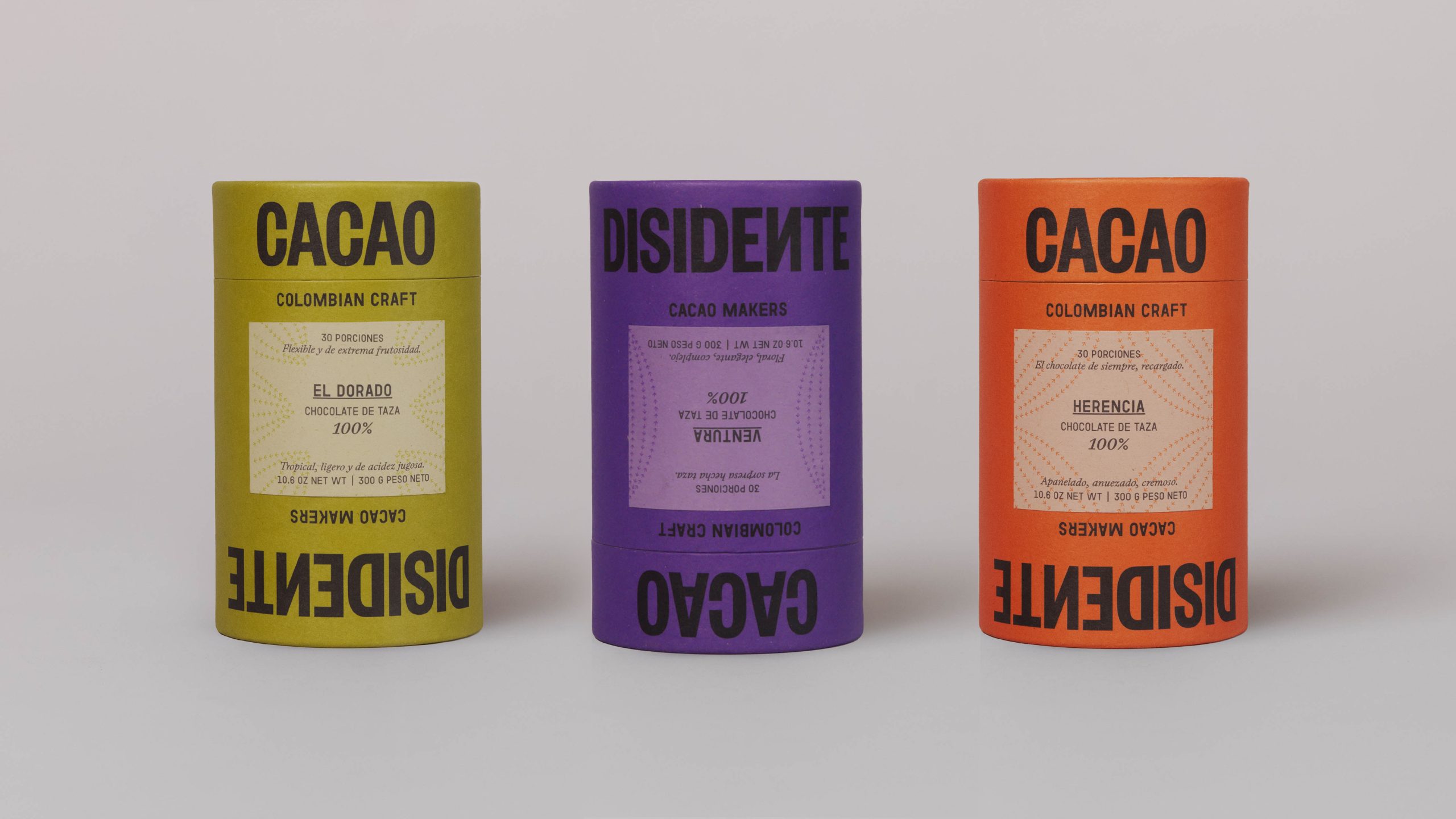
Cacao Disidente’s hot chocolate system by S&Co turns a simple cylindrical format into something quietly disruptive. The typography leans into oversized sans serif lettering wrapping around the form and flipping orientation so the product reads differently from every angle, creating a playful tension between control and rebellion.
Color becomes a key storytelling device, with saturated tones like deep purple, mustard yellow, and burnt orange that echo the richness of cacao. What makes this stand apart in the category is its refusal to lean on rustic or youthful clichés, instead presenting Colombian cacao as something elevated and graphic.

Cacao Disidente is a brand that develops Colombian specialty cacao. As its name suggests, “Disidente” means to defy a system — to question what is established and imagine another way. Therefore, it proposes a different way of producing, transforming, distributing, and consuming cacao-based products.

We wanted to bring that same idea into the design. The label resists alignment; it leans against convention. Whether the package stands upright or is turned upside down, the name remains unwavering. It insists on being read the same way — always, unmistakably, Disidente.