Odd One Out’s Tea Packaging Is A Quirky, Illustrative Lesson In Playful Design
By
Published
Filed under
By
Published
Filed under
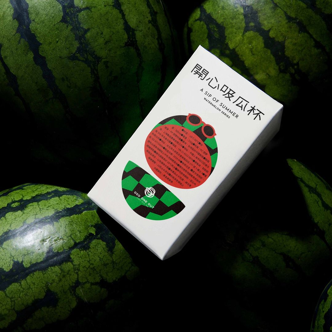
The packaging designed by Lung-Hao Chiang for ODD ONE OUT’s Summer Watermelon Series draws inspiration from pop art and gives consumers a window into the brand’s quirky personality.
The geometric watermelon illustration merges an almost street-style, fashion-forward vibe with a hint of humor, adding an offbeat touch to the product’s identity. The use of bright, contrasting colors and simple, circular shapes resembles a mid-century modern aesthetic, giving the packaging a quickly memorable aesthetic.
Is it an unconventional design system for tea? Yes. Does it make me want to purchase the product? Also yes.
Get unlimited access to latest industry news, 27,000+ articles and case studies.
Have an account? Sign in