There’s no shortage of great looking, high quality chocolate out there, but it’s especially refreshing to see designers have a lot more fun with its aesthetics. While this special occasion candy can have a bit of stuffy, almost ivory tower look to it, we’re happy to see brands infusing color and life into their packaging.
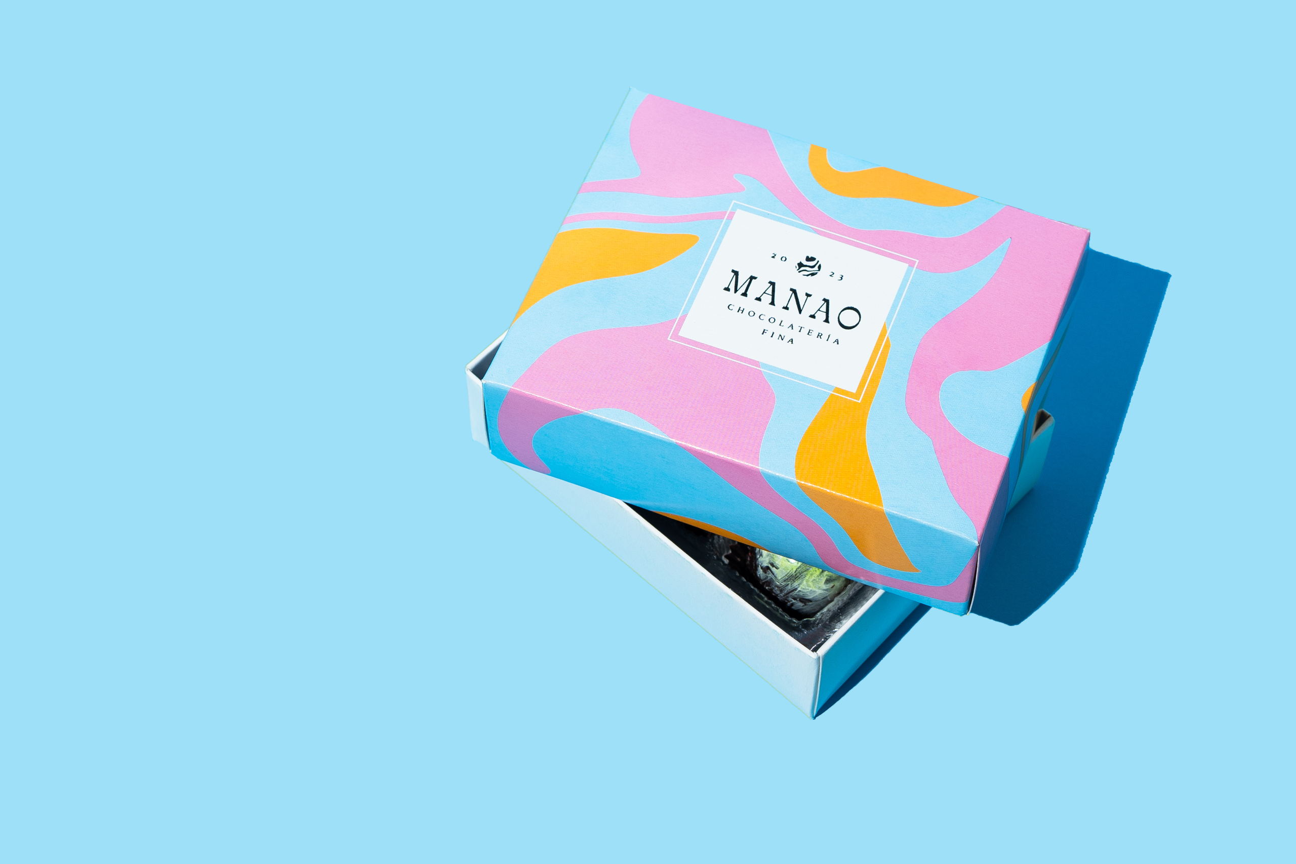
Caracter Studio’s design for Manao Chocolate has the carefree, abstract look of a childhood art project with a mature polish. It’s not hard to imagine the team really playing with this pattern in the same way a kid would with fingerpainting or spin art, which is a fun way to tap into the sometimes therapeutic energy behind getting yourself a fancy little treat with adult money. The box’s psychedelic design is also the perfect amuse-bouche for the gorgeous look of the colorful, marbled chocolates inside.