Light Becomes the Label With Vislumbre’s Minimal Design
By
Published
Filed under
By
Published
Filed under
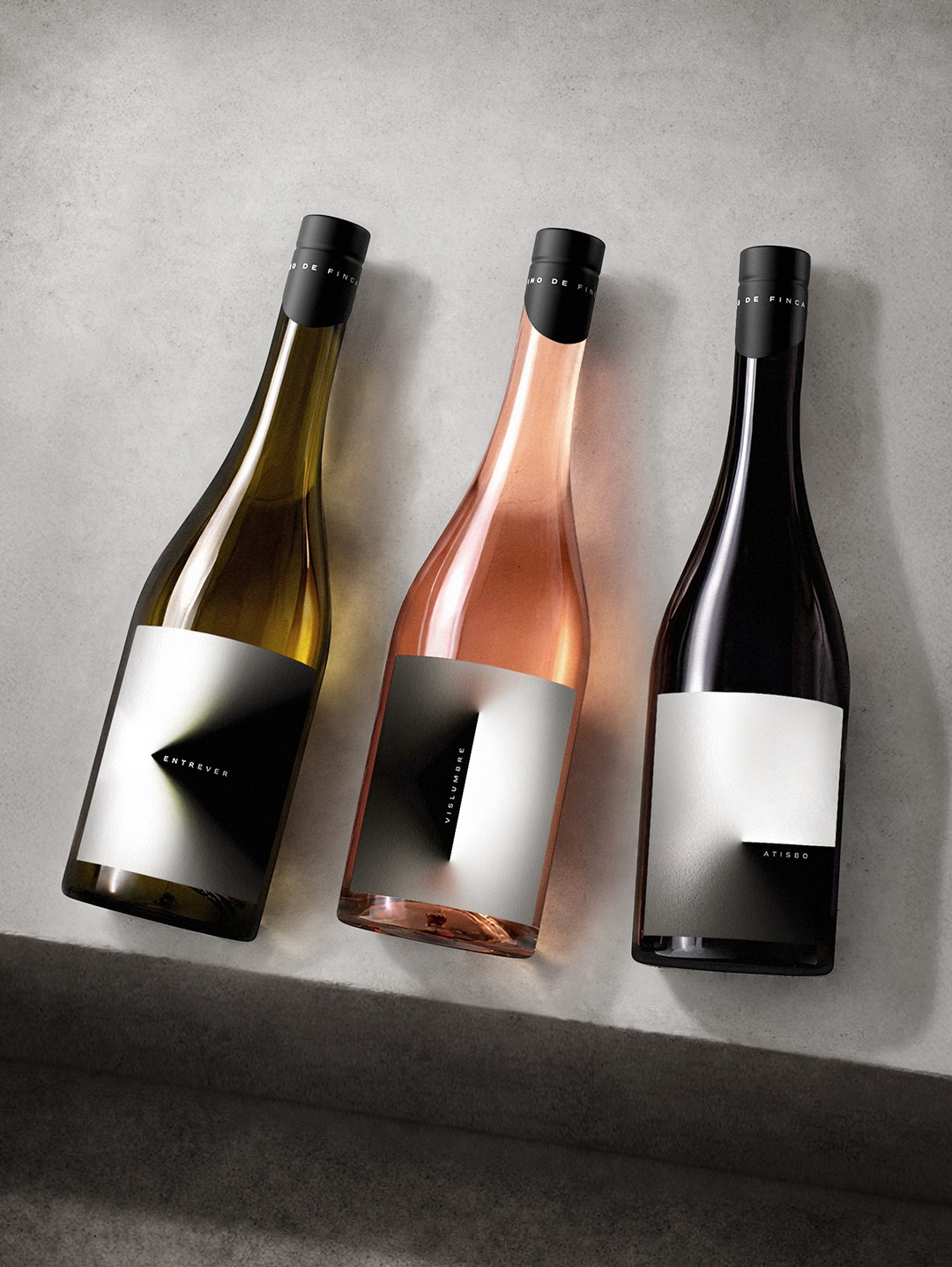
This label looks like a quiet study of light, but the longer you look, the more intriguing the idea becomes. For Vislumbre, the team at Seriesnemo created a wine identity that makes simplicity the core of the concept, building the label around how light bends, reflects, and disappears across the surface of a bottle.
A single folded geometric form appears to emerge from the center of the label, creating the illusion of light converging into a sharp point. The typography is deliberately restrained with small, spaced sans-serif letterforms. The palette stays almost entirely monochrome with soft whites and deep blacks that shift depending on the surrounding light, allowing the color of the wine itself to become part of the visual system. This design stands out in the wine category by removing nearly every decorative element. It’s a reminder that in packaging design, minimalism can become complex.
Get unlimited access to latest industry news, 27,000+ articles and case studies.
Have an account? Sign in