In an artful combination of simplicity and playfulness, the packaging of Vinos de Campo unveils a delightful experience. Crafted by Edward Pearson and illustrated by Mariano Ramos of Grafikart the label exudes honesty with a touch of screen-printed lacquer gracing the name and a halftone effect adorning each illustration. The classic sans-serif typography balances the illustrations, offering a whimsical and fun portrayal. Against the canvas of a creamy label, this design is a testament to the art of blending simplicity with a quirky, elegant charm.
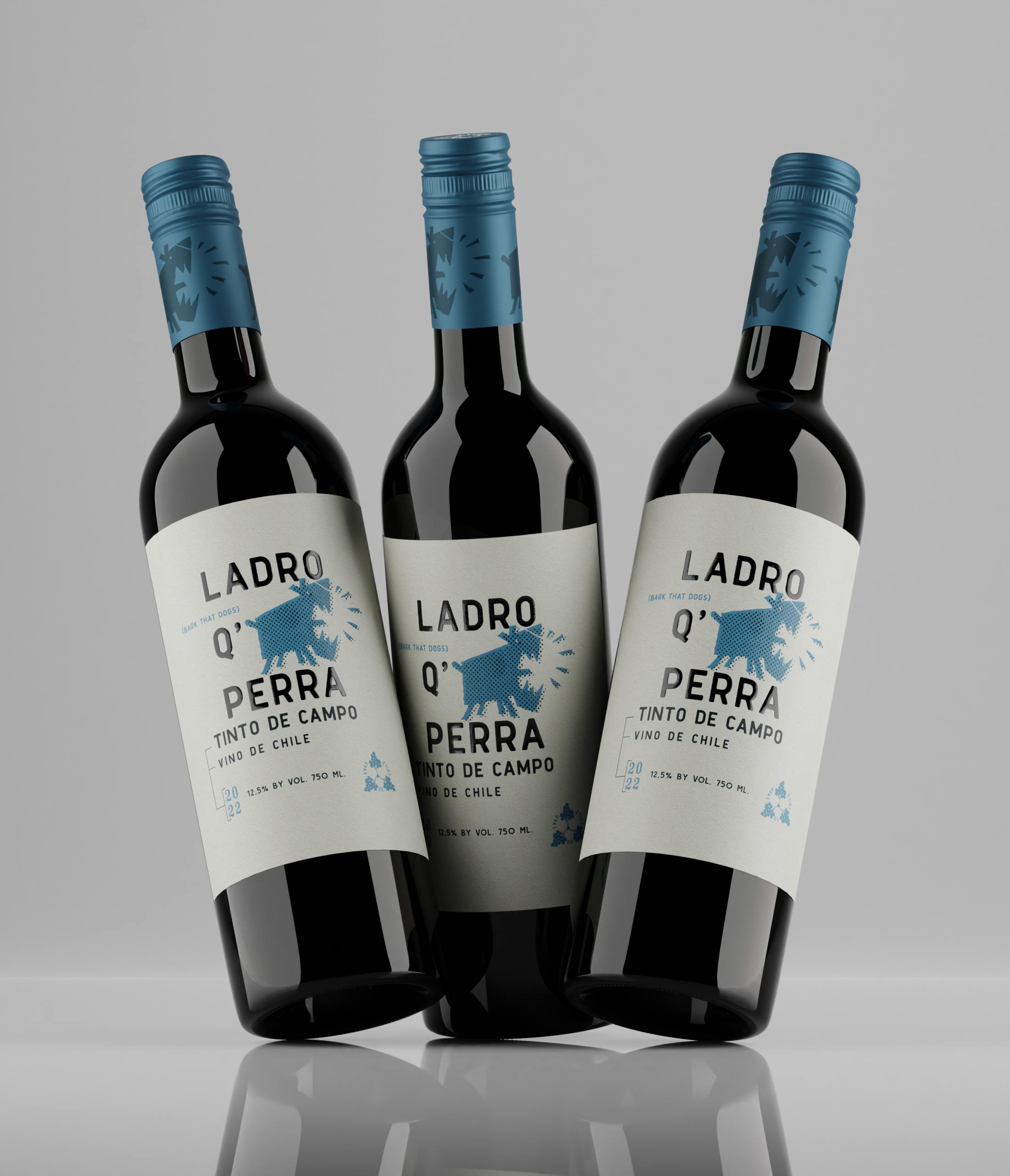
A tribute to two of the most characteristic sounds in the countryside. The Bark of a Dog and The Crowing of a Cock, both sounds announce something.