KA! Empathogenics Embraces Color To Set Itself Apart From The Herbal Supplement Space
By
Published
Filed under

By
Published
Filed under
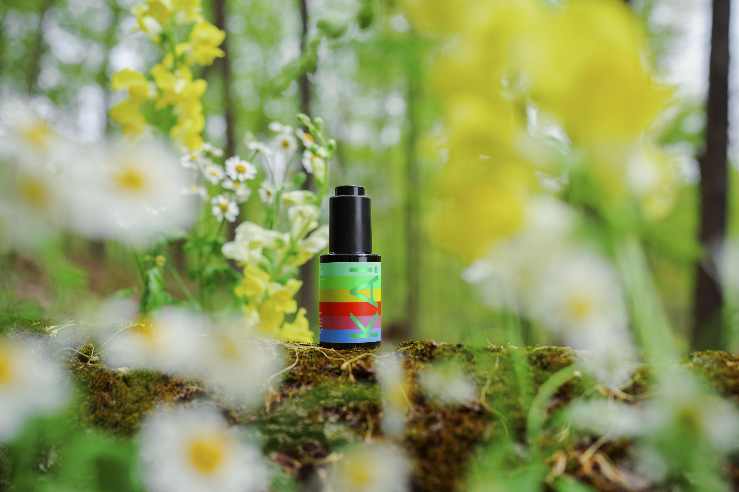
Baubo Studio‘s packaging for KA! Empathogenics takes a bold departure from the conventional pharmaceutical aesthetic. It boldly embraces striking and vivid colors, intriguing shapes, and playful foils, setting it apart in the herbal supplement market. Despite the maximalist approach to color, the packaging’s typography remains minimalist and elegant. Sans-serif typography ensures legibility while allowing dynamic colors and intricate patterns to take center stage, making it a unique and eye-catching addition to the brand’s identity.

Get unlimited access to latest industry news, 27,000+ articles and case studies.
Have an account? Sign in