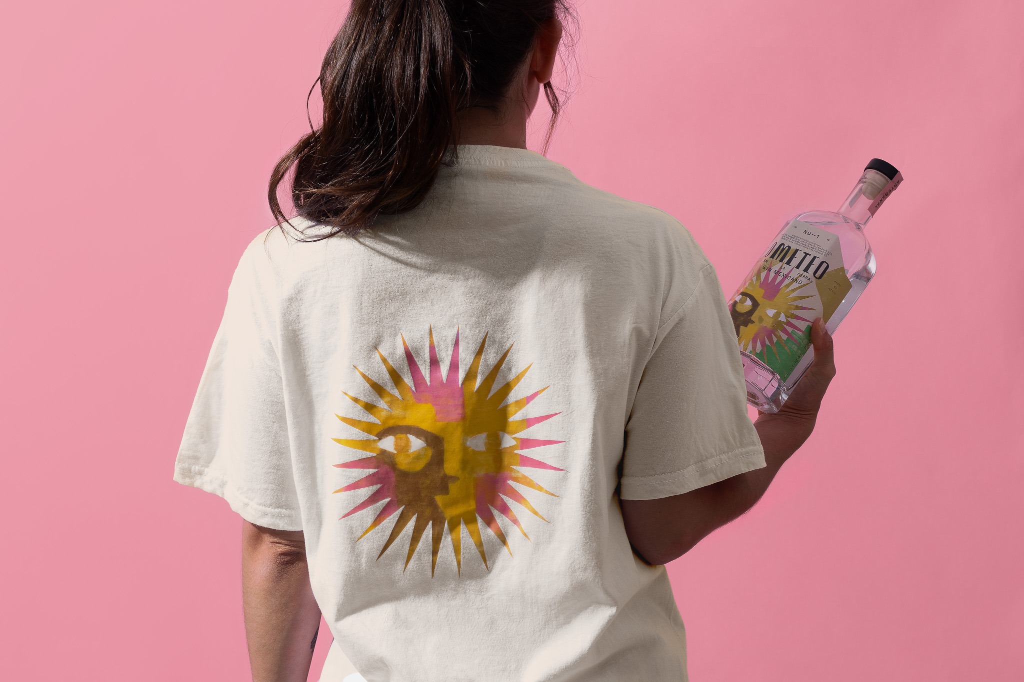
THIS IS IT! DIELINE Awards 2026 Late Entry Deadline Ends Feb 28
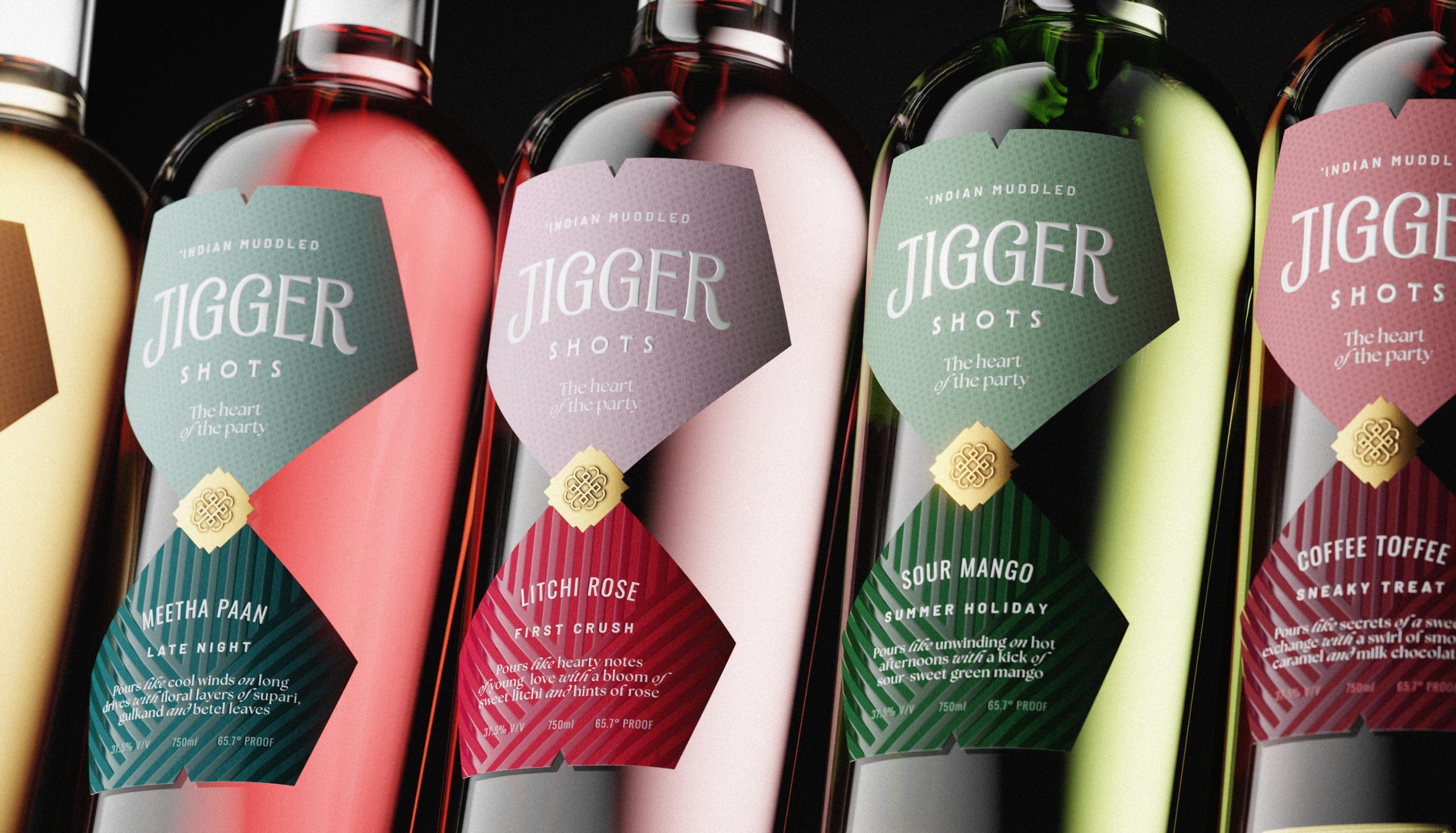
Jigger’s ‘Heart of the Party’ Embraces Light and Joy
By
Published
Filed under
By
Published
Filed under
Jigger’s packaging, designed by Unbound, leans into cocktail culture with a graphic system that feels closer to menu design than cliché liquor shelf packaging designs.
Serif-led typography is a reference to classic bar signage, while the metallic seals and saturated color blocking draw inspiration from Art Deco and midcentury-era spirits ads. Compared to minimalist competitors, Jigger embraces ornament and clarity, signaling indulgence and play without drifting into novelty.
Get unlimited access to latest industry news, 27,000+ articles and case studies.
Have an account? Sign in