- Blurr Bureau creates brand identity for upscale market Breadceterea.
- Breadcetera’s identity focuses on color and type, creating a harmonious, balanced brand.
I love bread. Not only is it tasty, but it also amazes me how four simple ingredients (water, flour, yeast, and salt) can be transformed into something so utterly delicious, not to mention how many different kinds of bread can be made from the same set of components.
Blurr Bureau’s work on the Australian bakery Breadcetera is similarly a wonderful execution of a handful of ingredients. Tasked with turning an empty storefront into a neighborhood market stocked with essentials like bread, pantry staples, and exotic provisions made for foodies, Blurr’s implementation is elegant, with a focus on typography and color.


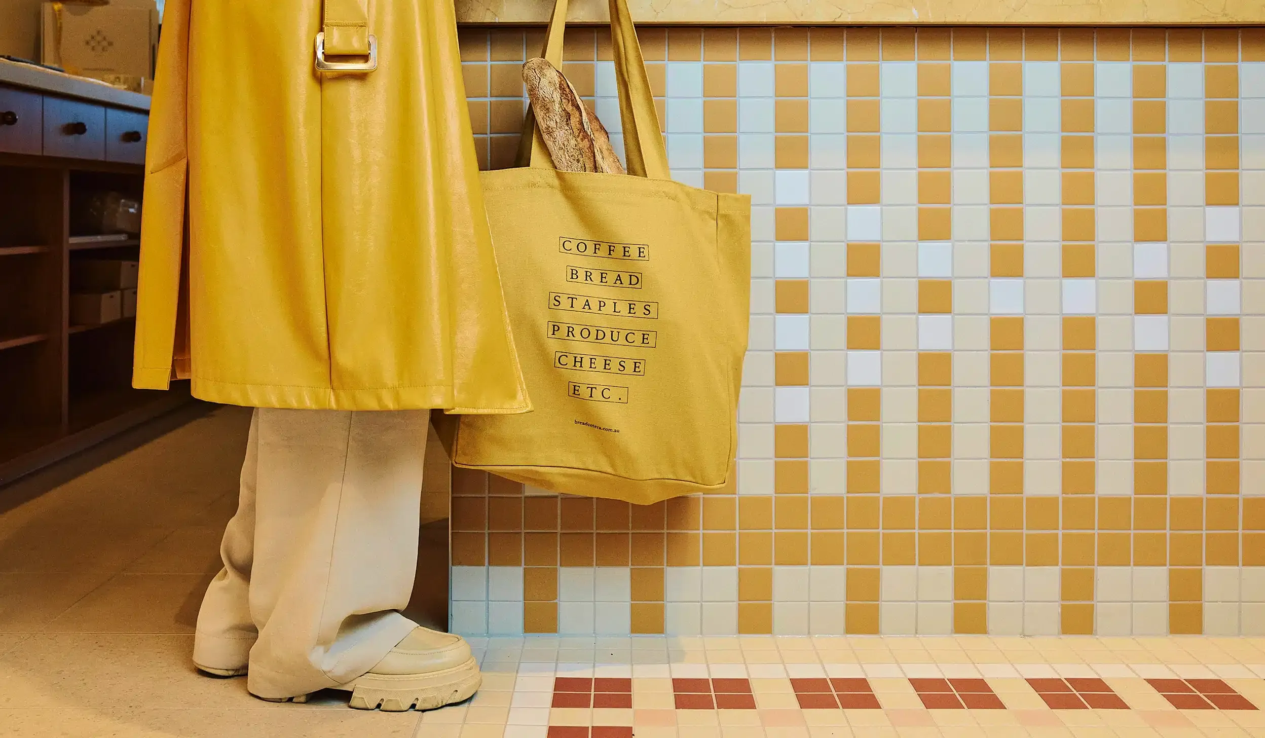
The bright yellow is cheery and inviting and appears on most touchpoints, including the storefront and packaging. It’s also used to great effect in tiled patterns paired with white. The yellow hue used is also reminiscent of one of bread’s BFFs, butter. Secondary colors like brown, beige, and off-white also evoke baked goods and add warmth and comfort, fitting for a cozy yet modern market.


In addition to color, typography plays a significant role in the Breadcetera visual identity. Blurr used Gaisyr Book and Book Italic to add elegance and flourish to the brand’s visual identity. The letterforms are visually attractive when used as a wordmark and arranged in a diamond shape as “BREADETC.” The type retains its impact across media, including digital, merchandise, fabric, and packaging.
Gaisyr does an excellent job on labels and imagery of sumptuous food. There’s a subtle balance at play that seems designed not to be noticed. The typography, color, and photography all blend well together, and neither overshadows the others.


Surprisingly, packaging tape is where the elements of color and type really shine. Whereas most brands would simply print their logo or a tagline on packaging tape, Breadcetera goes further, pairing buttery yellow and bready brown with that diamond-grid “BREADETC.” logo on the tape.
For items like muesli, fruit preserves, and sauces, that buttery yellow dominates the packaging. Yellow indicates the “Etc.” items the brand has on offer; bread might be the star, but the use of a brighter, more eye-catching yellow brings the “Etc.” items to the fore, standing alongside it. In most cases, packaging uses transparent windows and clear jars and bottles to highlight the product, with yellow used on lids, labels, and bags.


The use of grids and blocks also creates balance with the organic shapes inherent in bread and its various complementary items, as well as the “Etc.” offered by Breadcetera. In some cases, letterforms are encased in square-like tiles and in others, placed within white rectangles against a yellow background.

Photography is pleasant, and art direction does a superb job of communicating Breadcetera’s upscale nature and premium offerings. The high-end vibe is made clear, but doesn’t go so far as to be uninviting. Sandwiches look appetizing, as do the rest of their products.
Breadcetera’s brand identity shows how something complex can be from a few simple ingredients, just like bread. But instead of using flour, water, yeast, and salt, Blurr Bureau uses typography, color, and grids. The execution is a wonderful balance of each ingredient working harmoniously to create Breadcetera’s welcoming visual identity. Ultimately, Breadcetera’s branding invites the curious and turns them into regular patrons.


