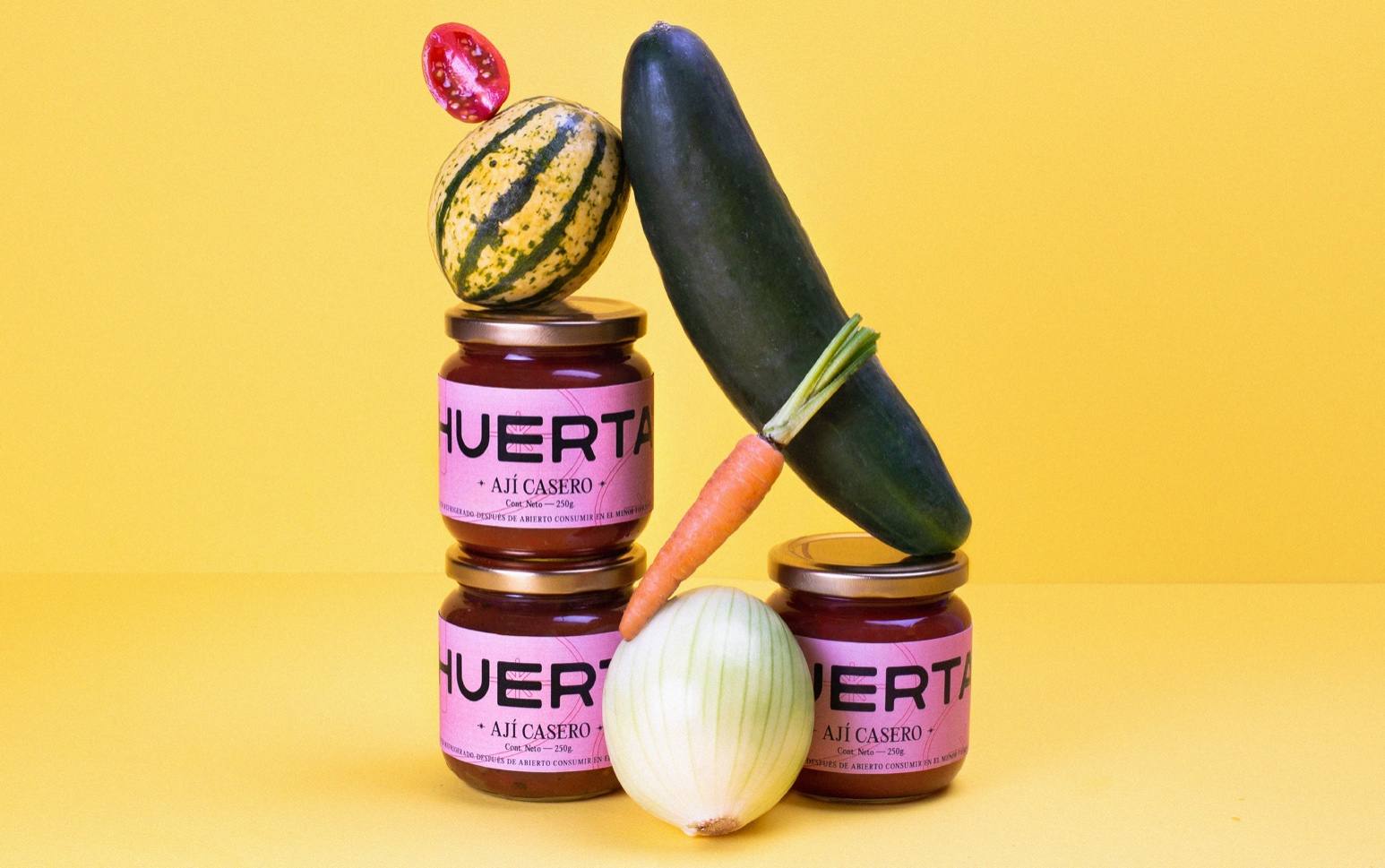
Contradicting the understanding of adult life and the novelty of youth, Huerta’s packaging, designed by Folk Estudio, feels wonderfully balanced. The bright colors paired with straightforward typography create a warm system that feels both refreshing and familiar.

Enoying a good hogao or a good chili sauce as a philosophy of life is what Huerta seeks. A brand that wants to bring to the present those memories of infancy or childhood, based on a high-quality recipe to accompany our cravings. This is how Huerta manages to remember those Sunday lunches, family barbecues or moments with friends, in which good taste is synonymous of plenitude. Through a balanced identity between the traditional and the impressive, Huerta positions itself as the experience of adult life, reaching out to the freshness of youth.