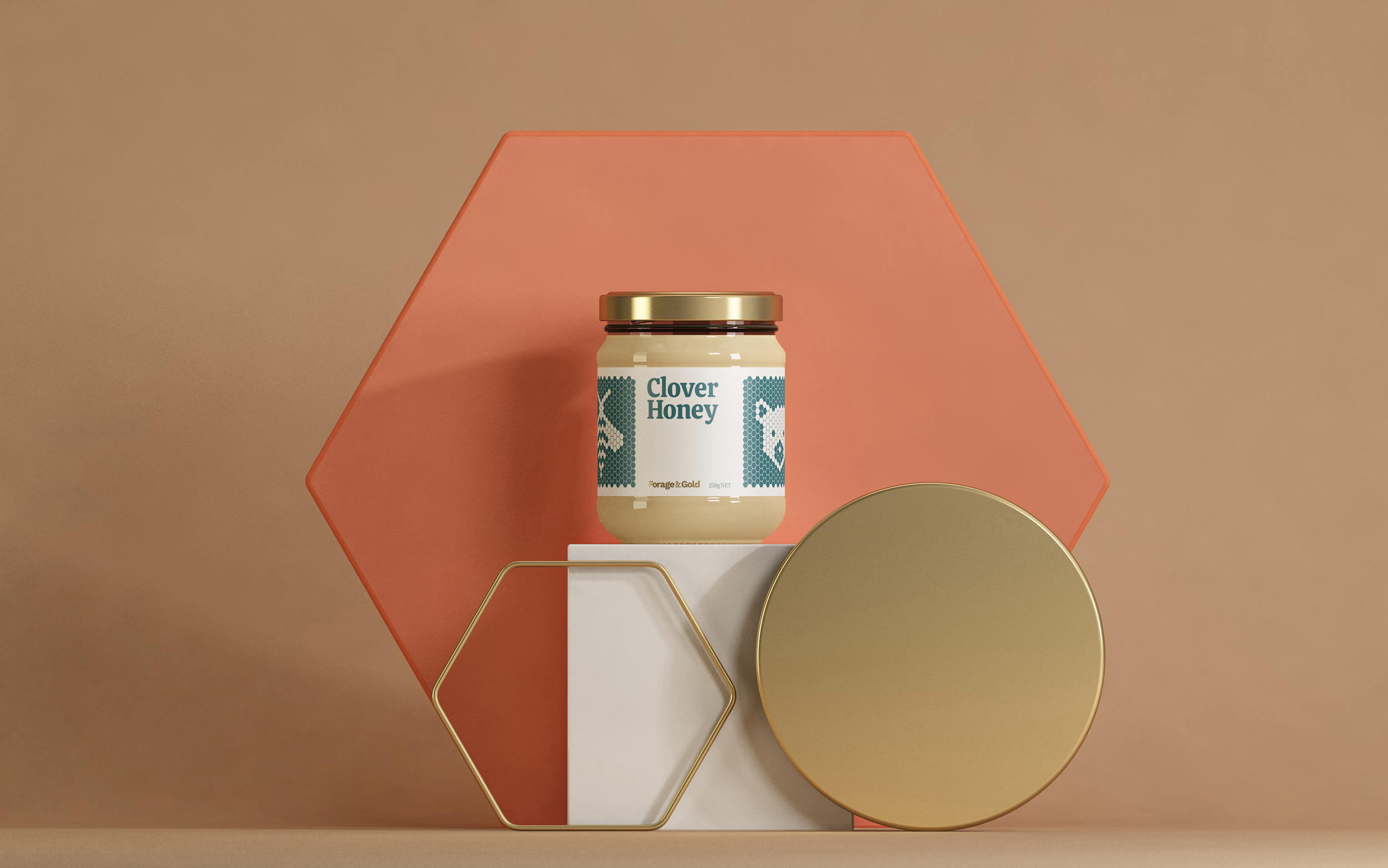
‘Bee Happy, Bee Healthy’ was the Honey Cheerios slogan, but that same mentality could apply to the gorgeous design for Forage & Gold, a line of gourmet honeys. Each label is a cream color, which pairs nicely with the rich colors utilized to denote flavor variants. The typeface used for the branding is warm, and inviting, like the cup of tea you’ll add this honey to. ??Our favorite design element has to be the honeycombs, which work together to create both the label as well as the illustrations.
In nature, everything works together, and the same can be said for all the design elements on Forage & Gold.
We are flower hunters, field finders and honey testers, storytellers, creators & nature lovers. From our gate to your kitchen, with a plan to change the way you think about this naturally available superfood. Each location is sourced with purpose, and each of our processes perfected over generations. With the next generation in mind, our mission is simple; we want to do better.